Individual Challenge
Project Time: 10 Weeks
Rewards: Help manage, transfer, share and redeem rewards points with family and friends
// Process
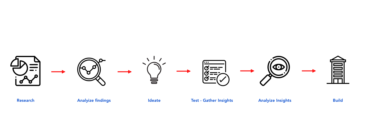
// The Problem - Research
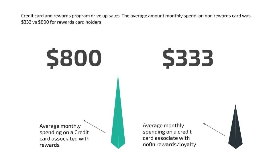
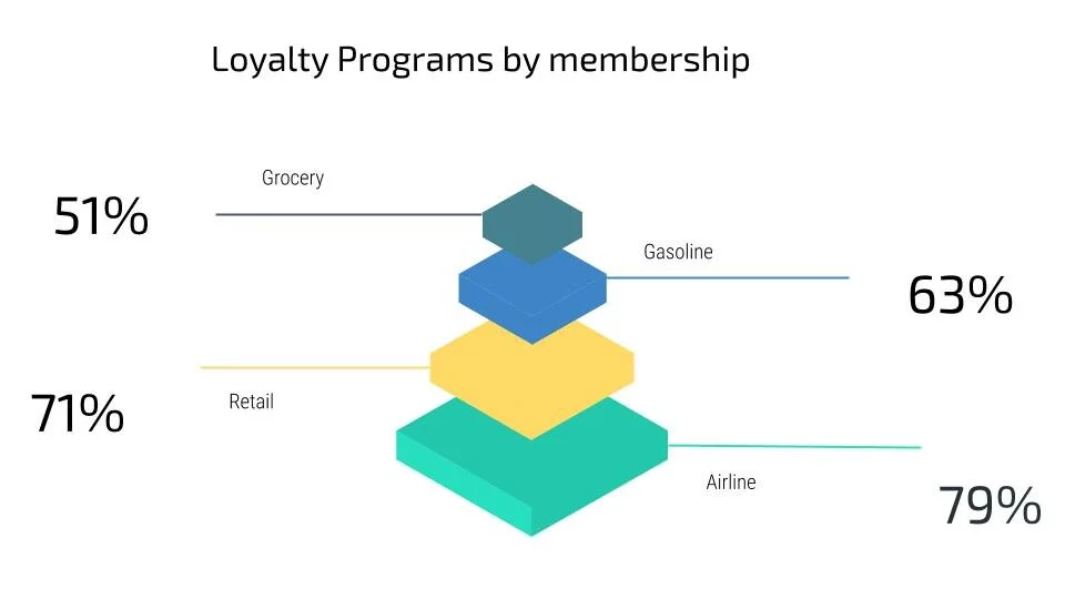
Rewards programs are part of the fibre of western economy. They are woven through both the wrap and the weft. Over time they have become both pervasive and popular. In fact, it is hard to imagine a scenario in which consumers do not expect rewards including for travel, shopping, grocery and airlines. The problem I explored was how often users redeem these rewards and if so what can be done in order to help these individuals or families. Having the problem in mind, I set out to research and what I found put a was a majority of the users do not even end up redeeming their rewards, often not realizing the value. A staggering 47% of users forget to redeem their rewards. 38% of millennials cash in rewards at a higher rate compared to boomers. Users usually end up forgetting how many miles they have acquired, and not truly understanding the value, they often letting miles expire without redeeming them. Below is an indication on how reward programs drive up the average spending amount, and the percentage of consumers who belong to rewards programs per sector.
After doing secondary research I was certain that there is an opportunity for a design intervention here. I set out to explore and refine my focus for my solution, and settled with the one below.

HOW MIGHT WE help individuals manage all their earned rewards from various providers so they do not go to waste
The biggest metric that stood out was that users are eager to join different reward programs but end up forgetting to redeem, leaving these points to go to waste.
// Preliminary Research
My preliminary research consisted of establishing a project brief at first. I believe that users need a platform where they have the freedom to and I wanted to outline a few key elements that I wanted my app to focus on. This also helped me establish Interview questions, as these objectives are the back bone of the research I conducted.
Show users insights around loyalty programs
Help users set goals towards redeeming their loyalty program
Help user track their loyalty rewards
Help users manage their loyal rewards
Help users share their rewards with family and friends
Help users redeem their loyalty programs before expiring
Help users exchange loyalty points between different programs
After gathering information from secondary research I could go ahead and establish a few constraints. They speak to four key elements that might impede the development of the app.
Constraints
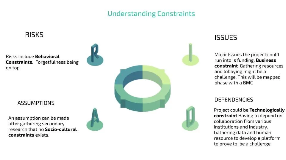
Once I established constraints, I set out to interview people in order to get an understanding of the main pain points.
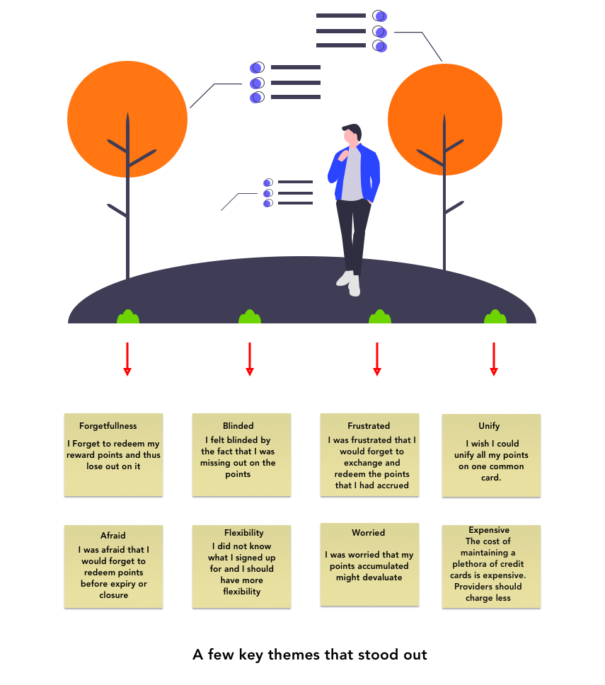
Themes and Insights
Interview Notes
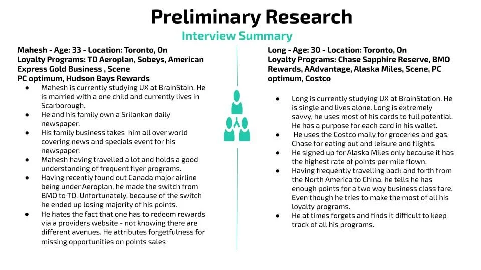
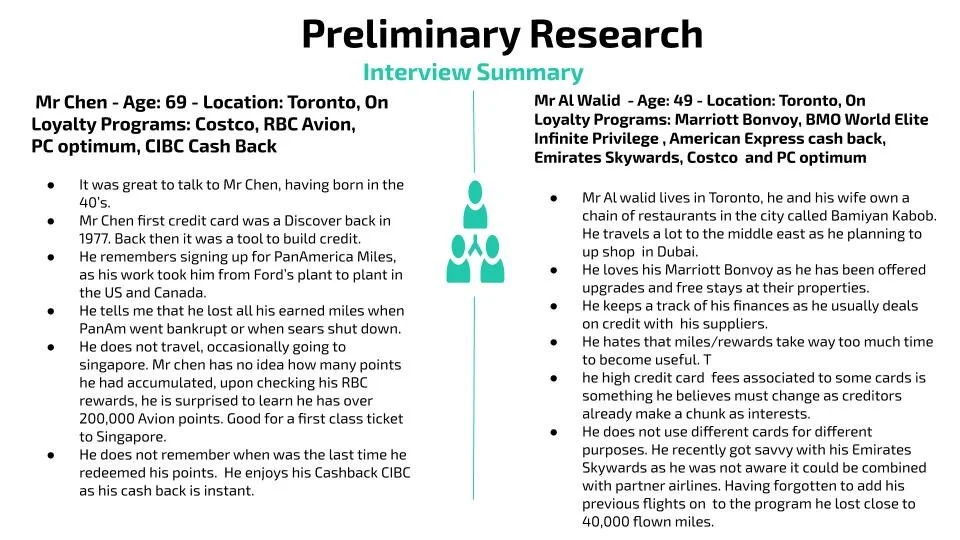
Through the interviews, I gathered a few themes that were focused on a this in particular
Users forget to redeem the rewards and loyalty points on their credit cards and especially the small loyalty associated program cards.
They also wished they could consolidate their rewards points so that they could exchange and share them with immediate family members and friends.
Below are the main pain points I gathered from the interviews.
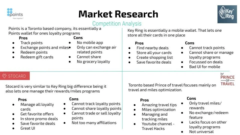
Market Research
After gathering themes, I wanted to look towards the market and do a comparative analysis of what’s out there.
Hypothesis
After gathering insights from preliminary secondary research, I was able to establish the following hypothesis:
I believe that providing people with the ability to easily transfer, consolidate, exchange and share their rewards points will help them achieve optimum satisfaction from their credit cards and small loyalty program cards.
I will know that I am right or wrong when I test my research findings and see that people are satisfied with the way they redeem, unify and exchange their reward points. I will know this is true when I see a successful relationship established between my quantitative findings and the users
//Opportunity of Intervention
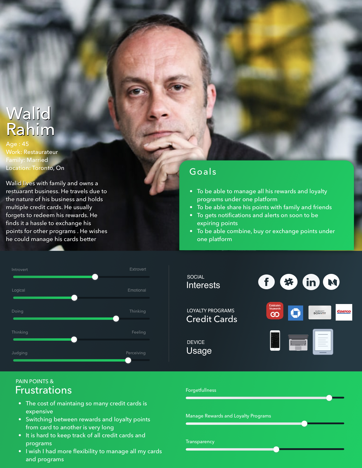
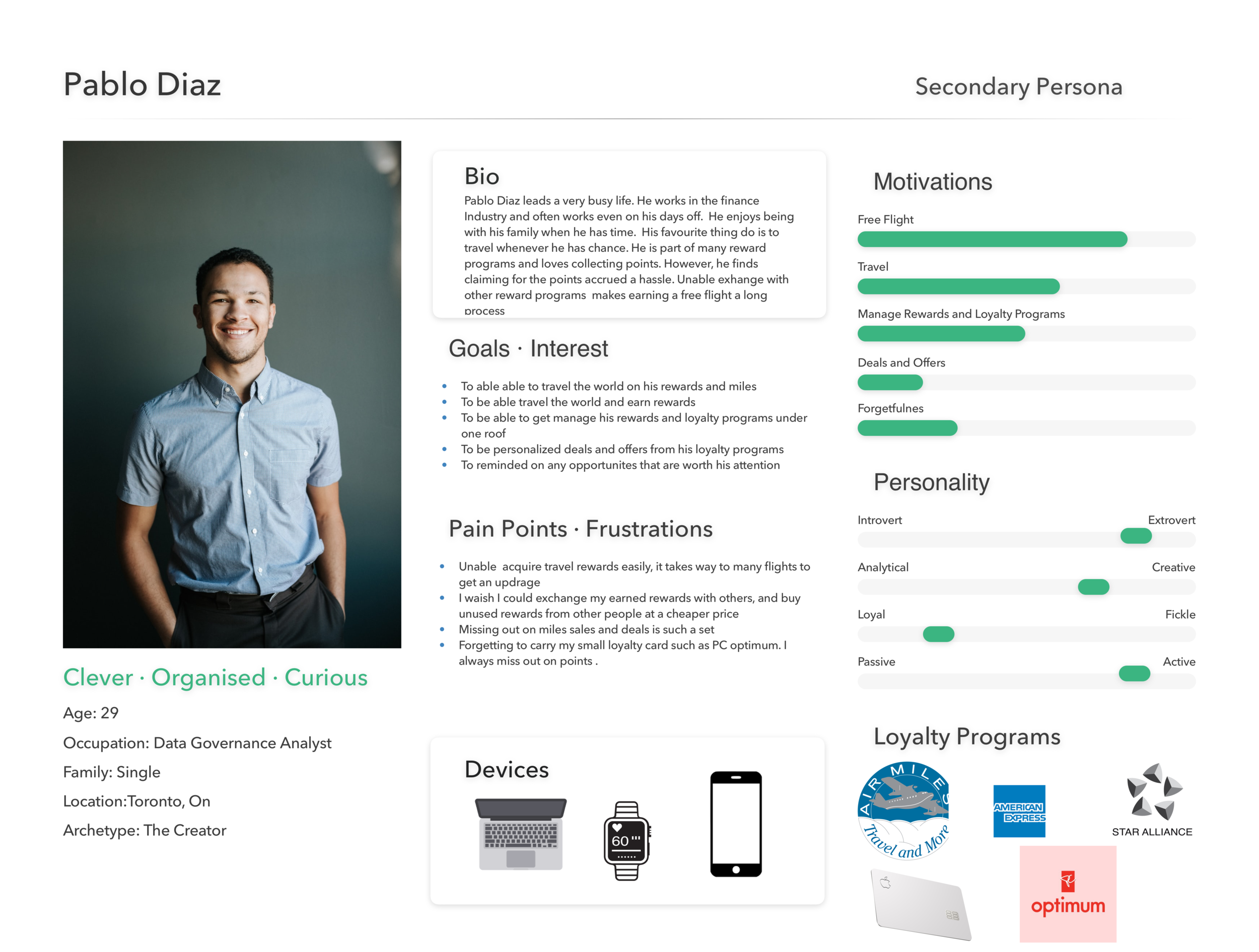
Persona
After conducting interviews and establishing the main pain points, I was quite certain there is a an opportunity of design intervention. I wanted to gather all the thoughts that shared similar interests and define a persona. To facilitate the design process, I made two personas - a primary and a secondary, shown below.
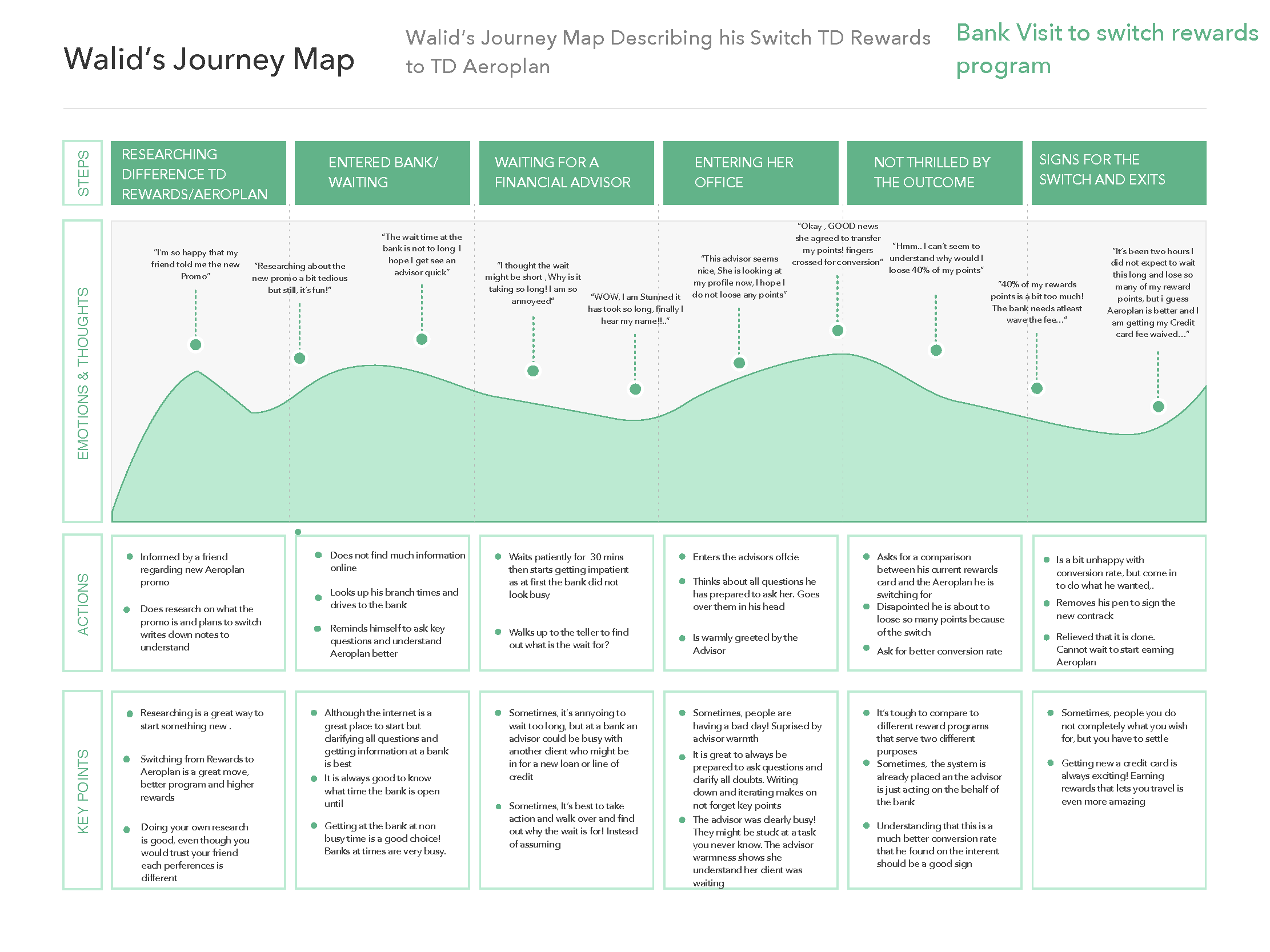
Experience Map

Based on the insights I gathered, I created a Journey Map, describing my persona’s journey trying to change his reward points from one program to the other. I documented all the ups and downs of the emotions and feelings that my persona went through— in various phases: researching the difference between different reward programs, deciding to meet with an advisor, waiting and then finally switching. From this process, I mapped a design intervention strategy.
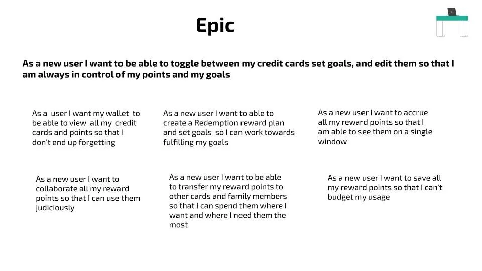
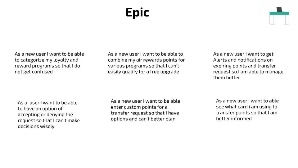
Epic
I then went ahead and wrote down some user stories, keeping my persona in mind. I wanted to highlight the major functions of the application that would benefit my persona. Then I chose an epic to focus on.
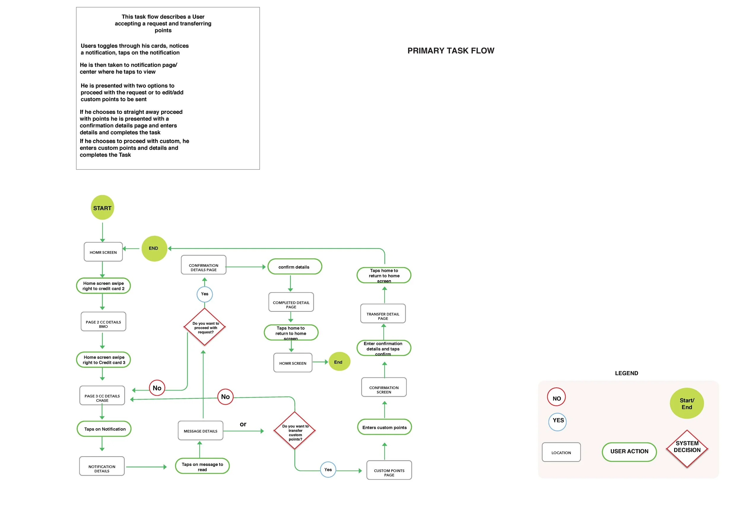
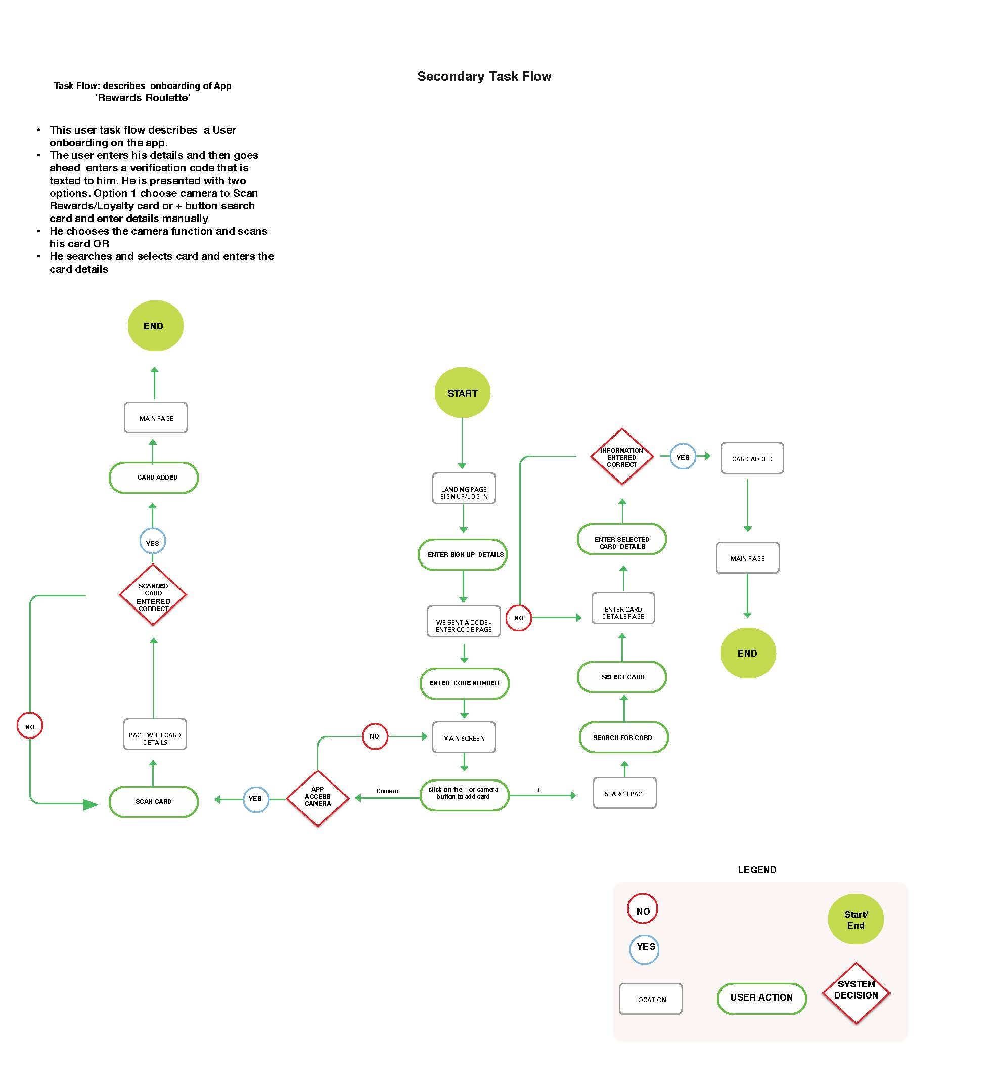
Task flow
Once I had my epic, I went ahead and created two task flows. The primary task flow entailed that the user receives a points transfer request from his son and transfers those points over. The secondary task flow involves the user adding a credit card using the built-in camera function or the search card feature.
// Visualizations & Prototyping
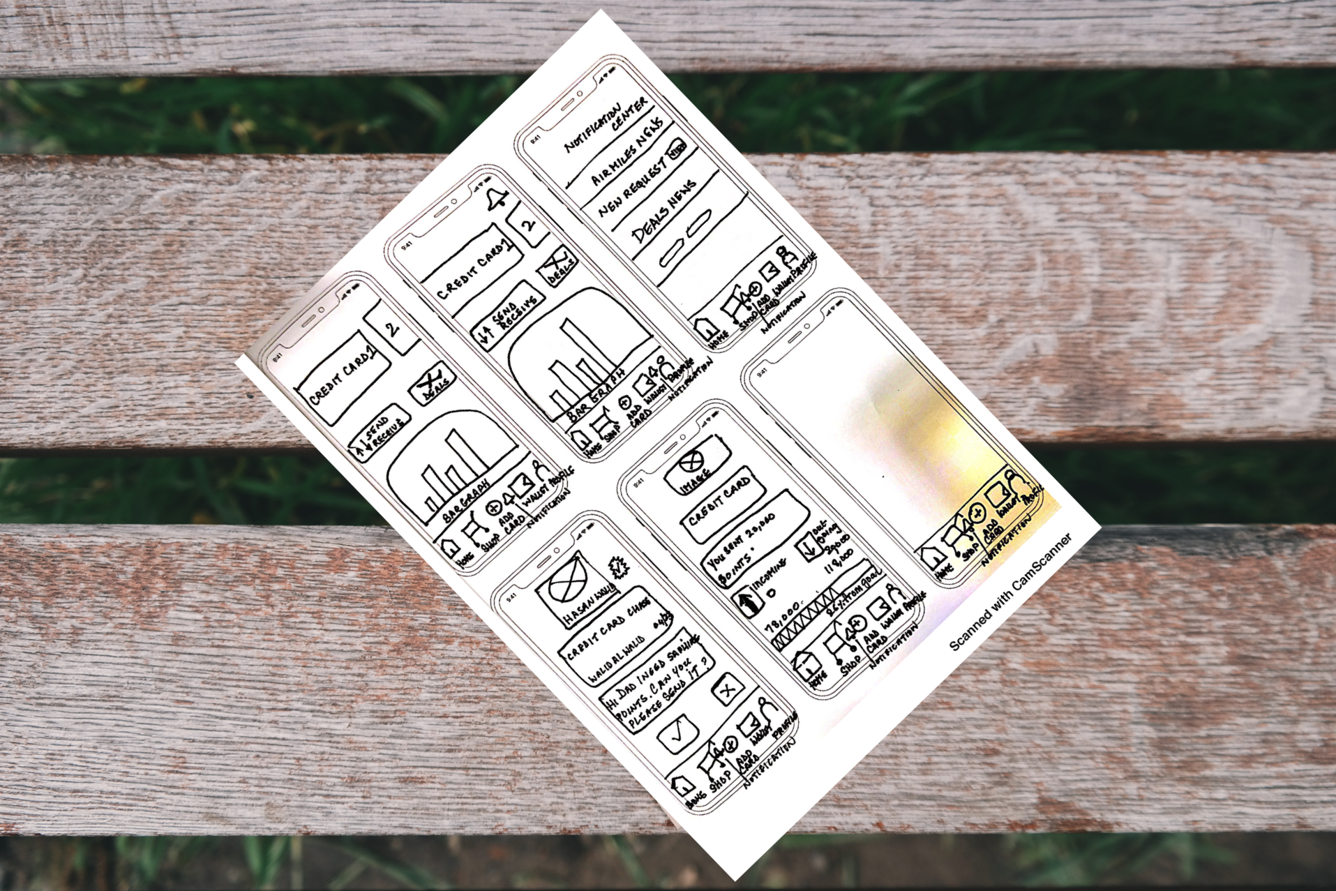
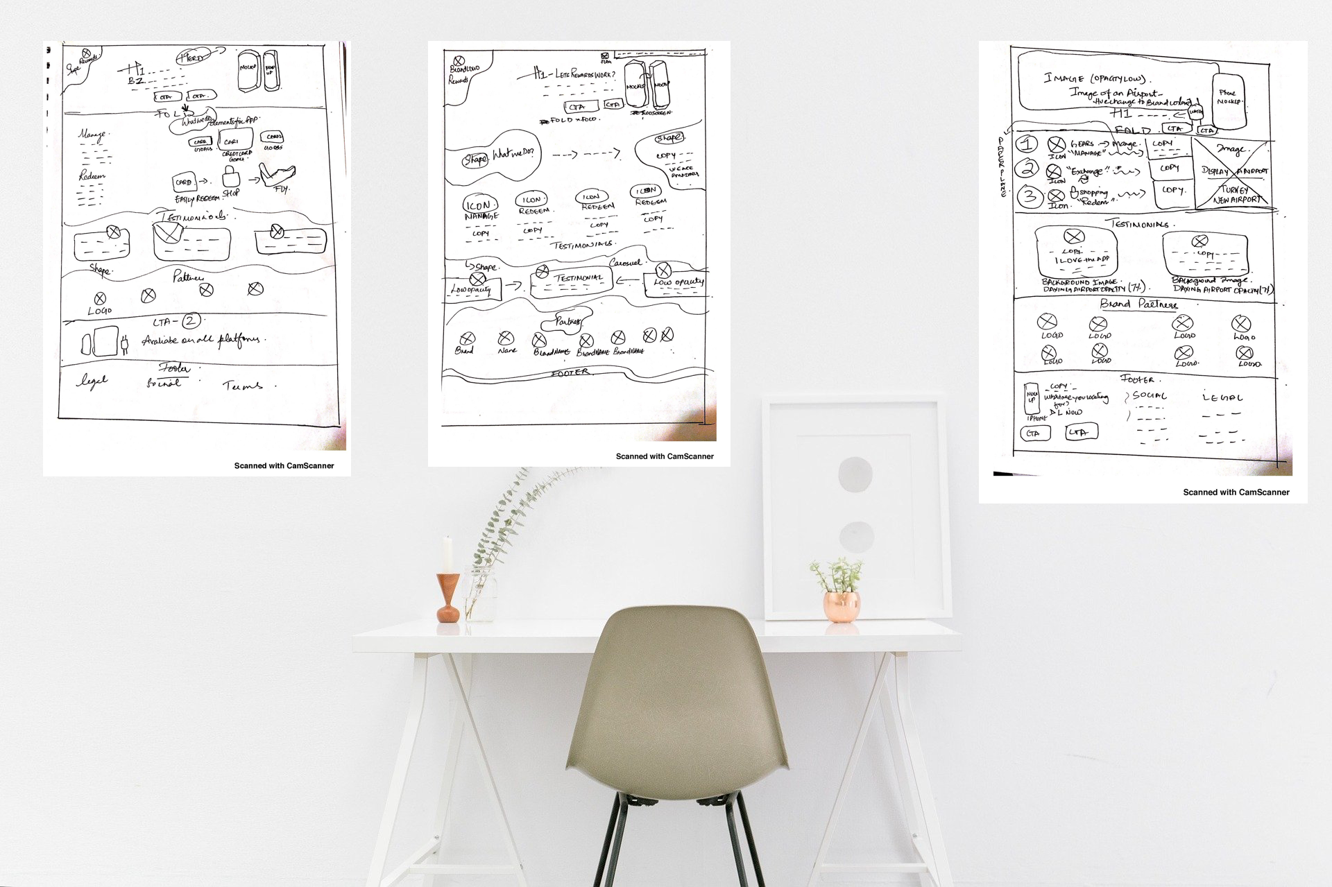
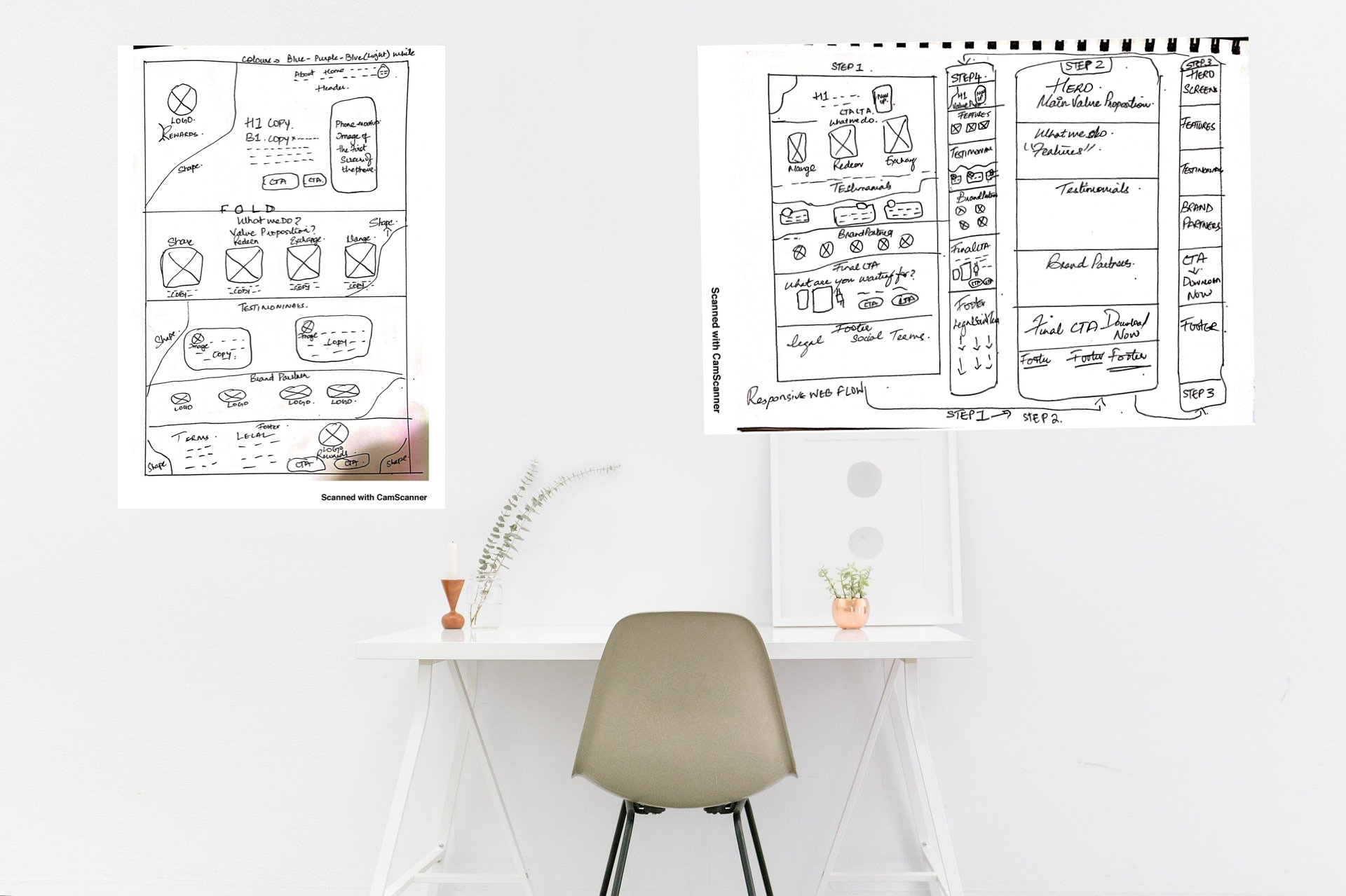
Sketches
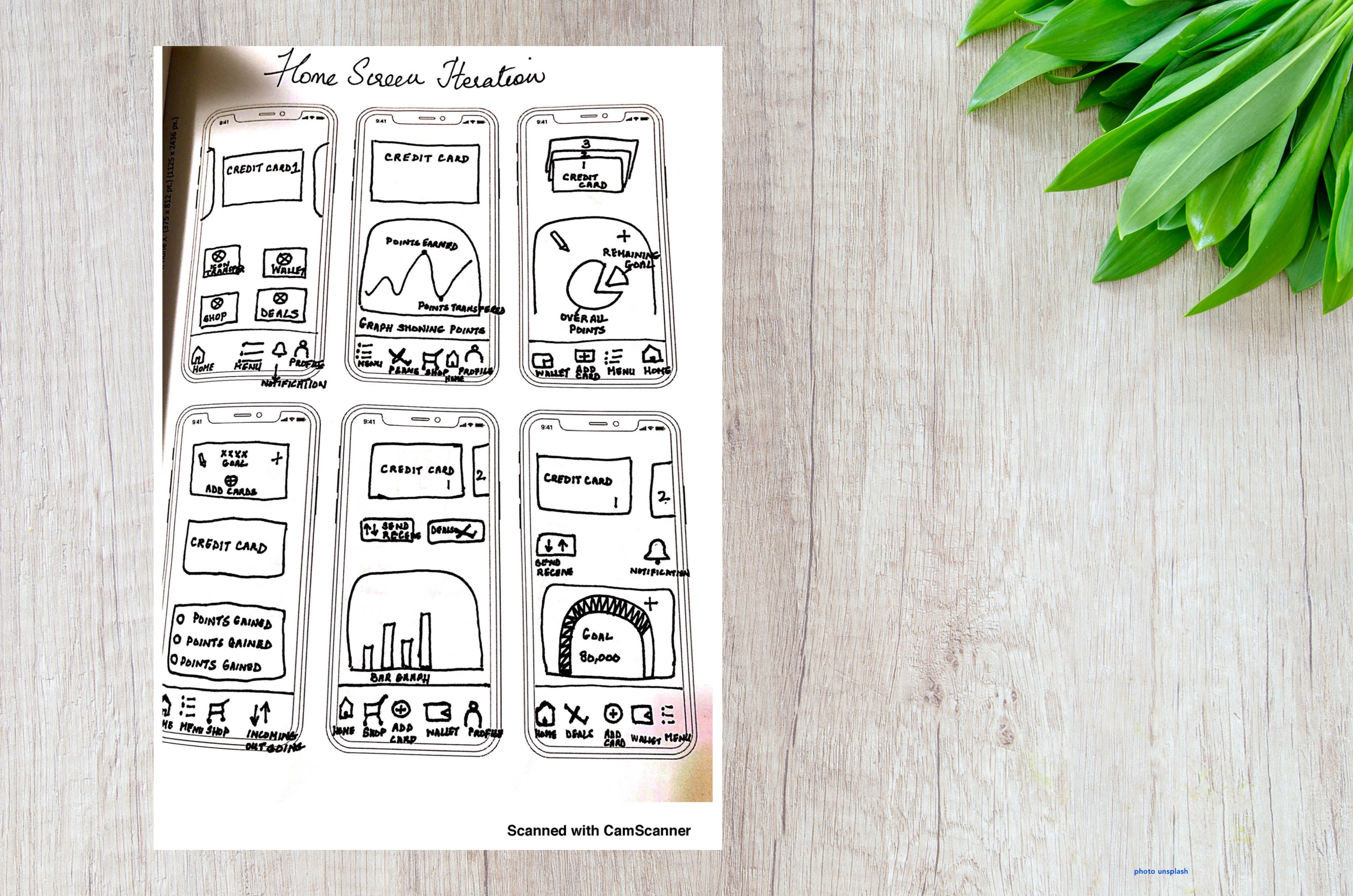
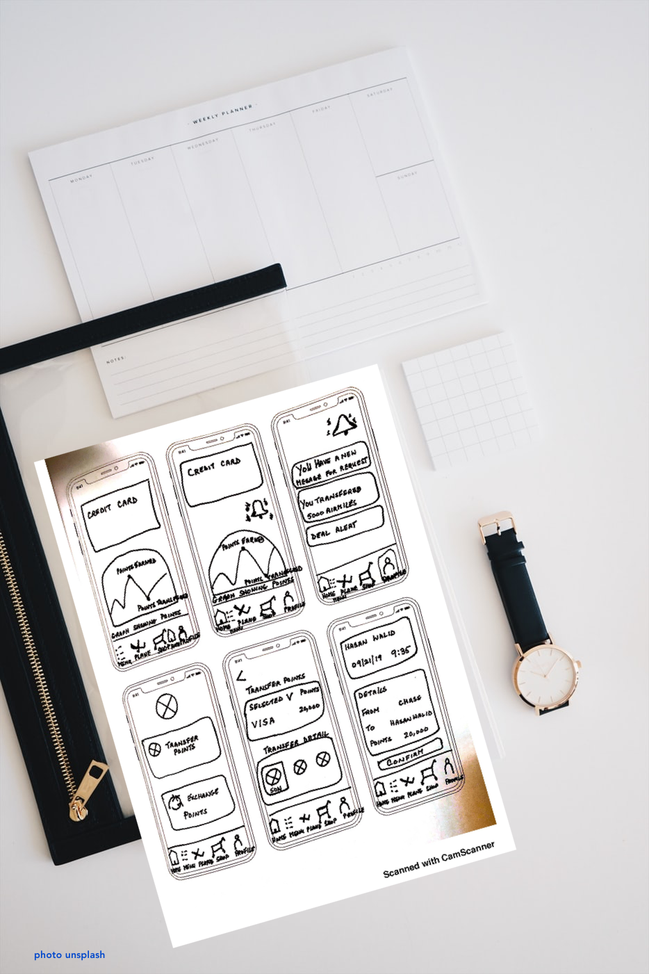
With my task flow done, I started to sketch ideas on paper of how my screens would look and how the primary task flow would be carried out. This proved invaluable, as I referenced these sketches again and again throughout my user testing.
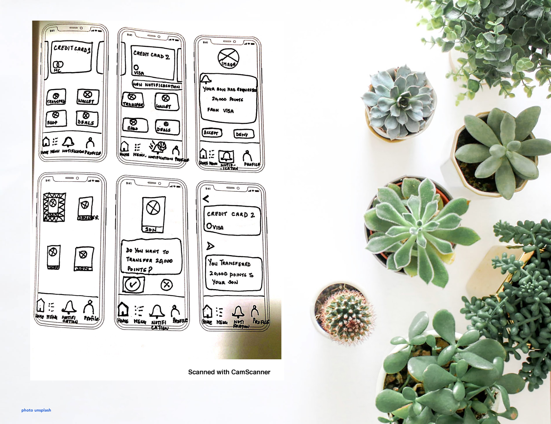
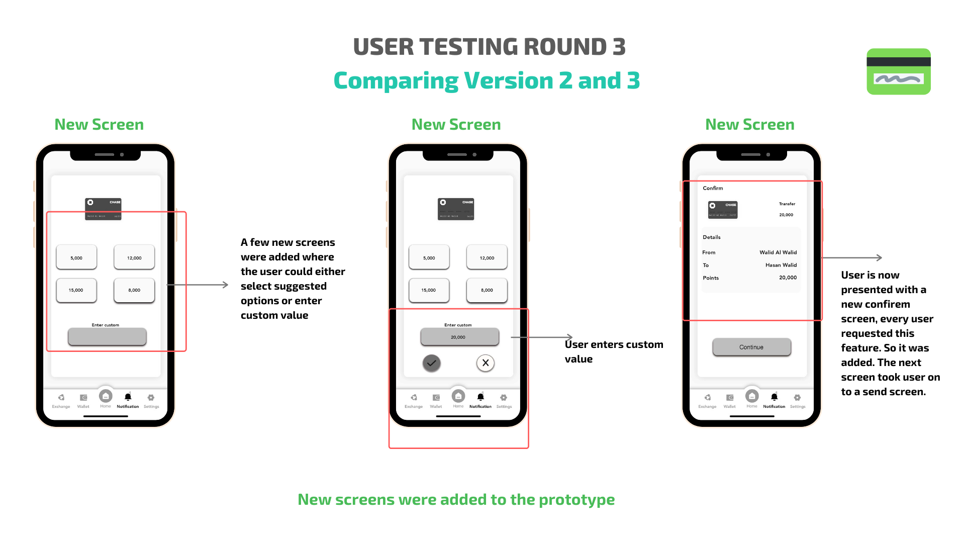
User Tests 1, 2 and 3
Each round of User Testing comprised of 5 user tests. Key insights from the feedback were taken into consideration while reworking the prototype. Here are a few things that stood out from each round:
In User Testing Round 1, all users were able to complete the task of sending 20,000 points to the user’s son. Here are some of the major points of feedback:
The first three screen were praised, specially the carousel design.
The icon layout of the bottom navigation bar was very easy to understand as each component was labeled and the icons spoke to each function.
There were some suggestions made to improve usability, especially concerning the task.
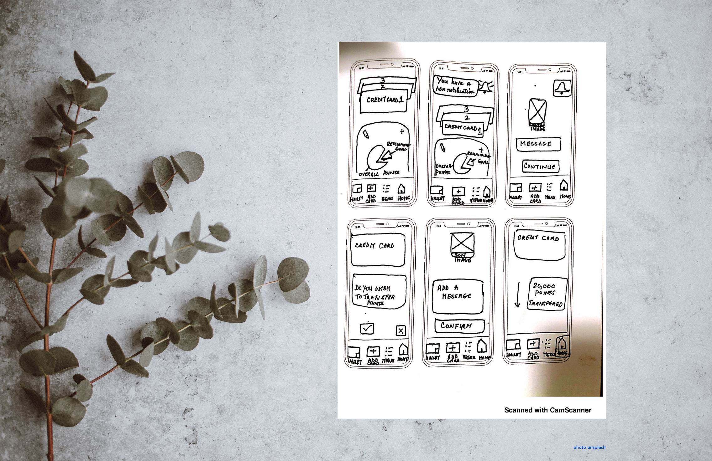
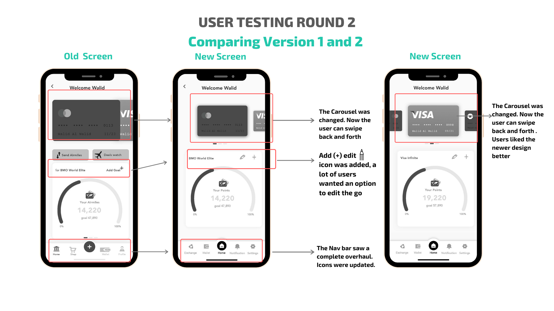
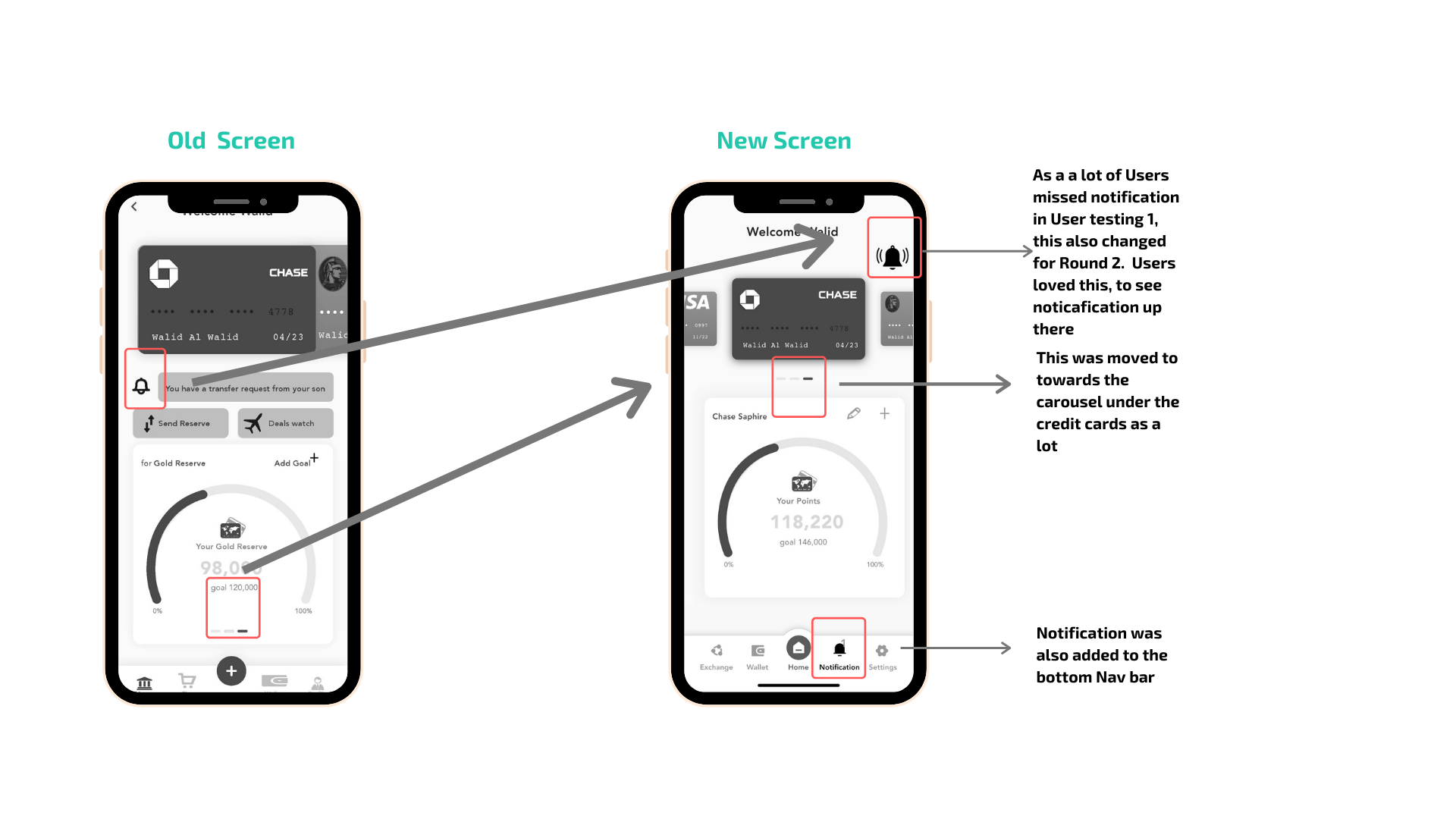
In User testing round 2, a lot of feedback that was given from round 1 was taken into considerations
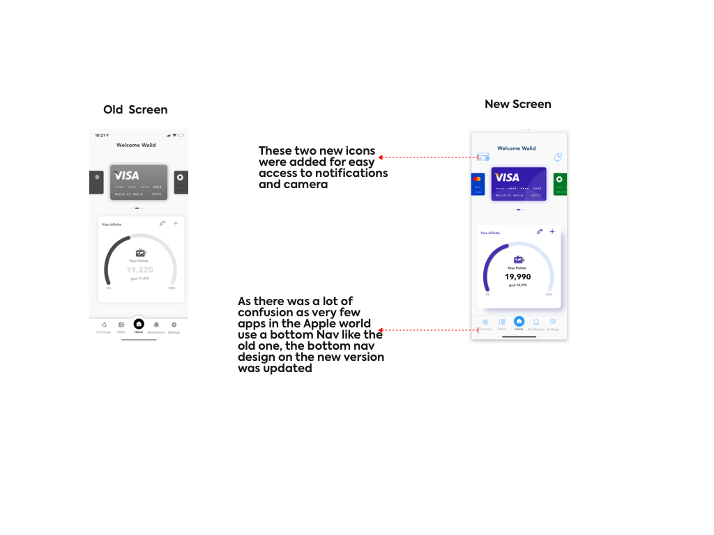
The icons were moved to the bottom nav bar and the home carousel design was updated
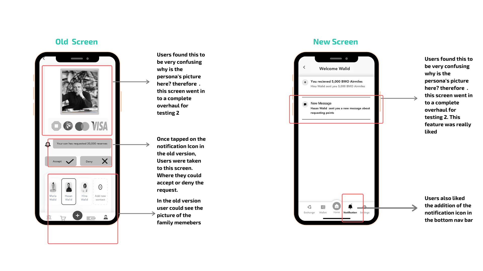
Notifications were given their own place on the bottom nav bar for ease of usability, since a lot of users missed the notification at first. As the Prototype was being designed for Round 2 - A few things were considered based on the persona
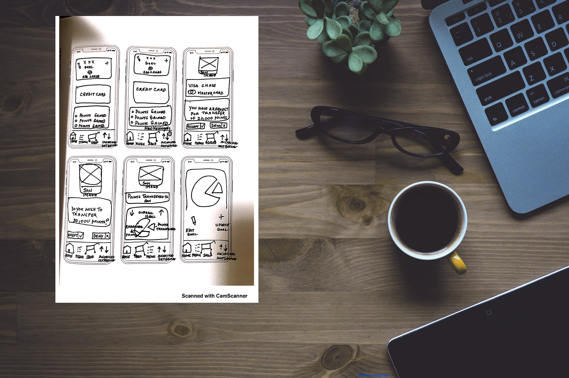
All key insights were taken into consideration, A few major likes and dislikes are given below
Likes Dislikes
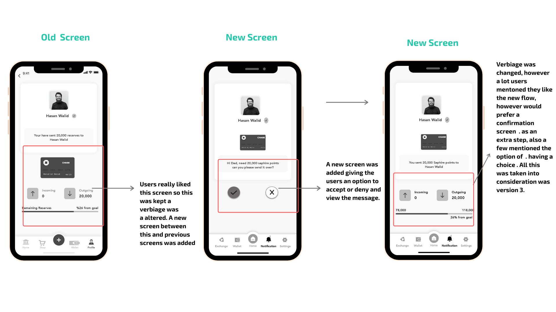
Users wished to go back forth between credit card and ability to edit goal
The Nav bar had issues, even though the icons spoke to the users, but functionality wise they were a huge opportunity
A lot of users missed the notification, so in Version 2 - It was made prominent
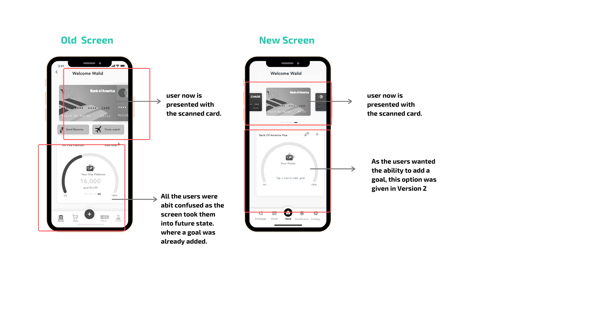
Users were not happy and were confused as to why they see a picture of the User? This was changed for round 2, a new screen was added
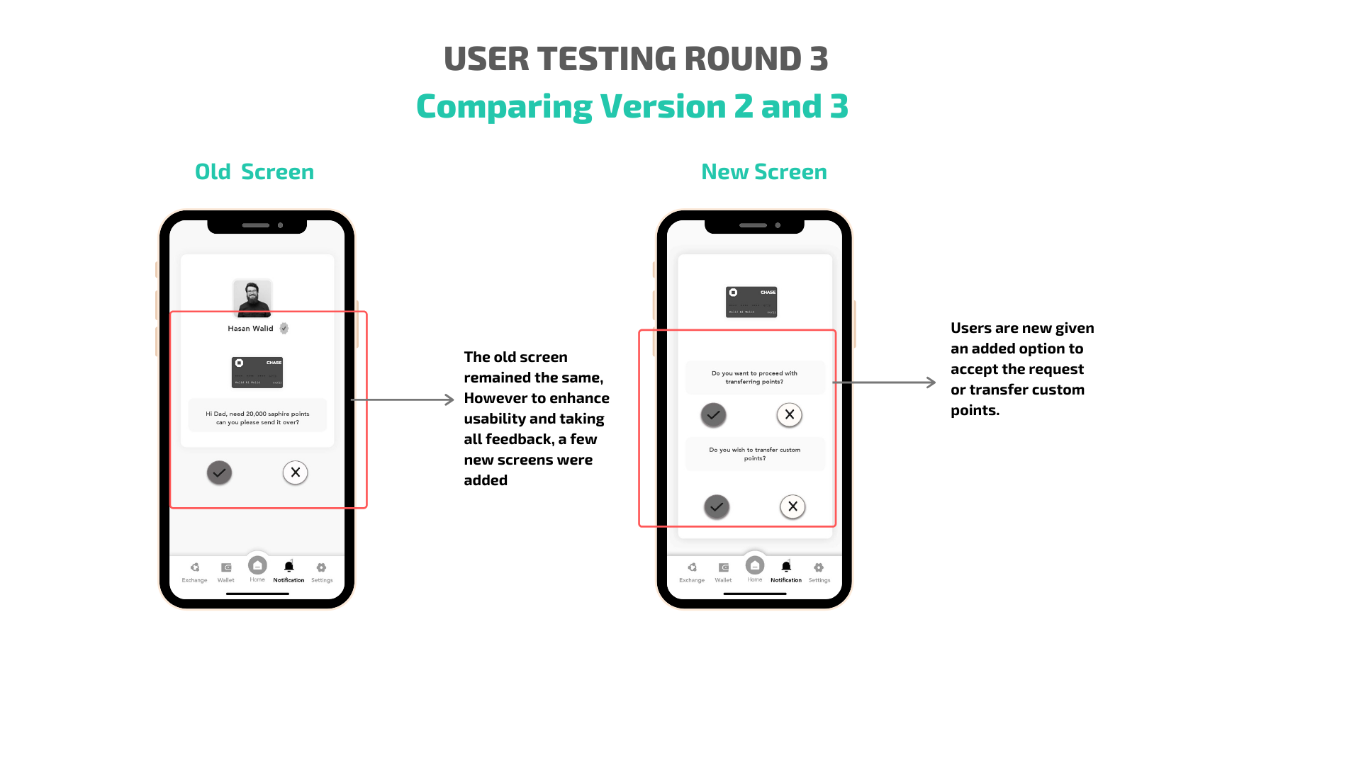
An option of accepting and denying was also reworded as there were a few usability errors
Users did not respond to the slide up gesture, this was reworked a new screen was added. (Additional Task)
Users loved the visual representation of the home screens, the ability to see the goal . was appreciated
Users also liked the carousel design, the ability to toggle between cards was voted best
Users had no confusion with icons on the home screen - Nav bar
Users like the idea one can add a new goal to the individual
Users liked the visual image of the person the points transfer is being sent to
Users liked the idea of outgoing points and were not confused with the labelling
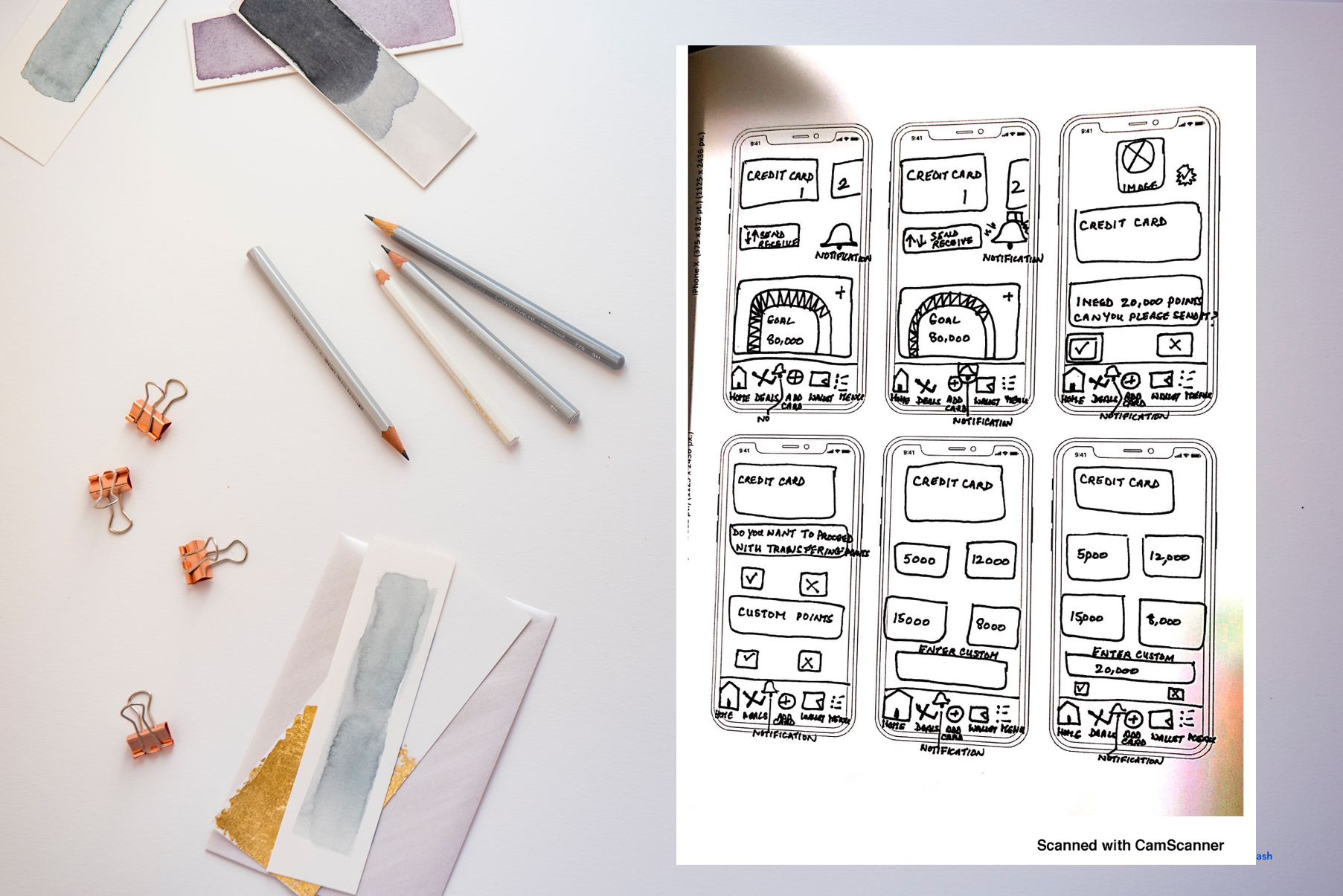
As we moved through Round 3 of User testing, it was important to keep the persona in mind.
Keeping our Persona at the Center of our design
Walid's biggest pain point was his inability to track his points and share them amongst his family instead of selling them at a very low rate on the open market.
The aim here is to keep Walid's pain points in mind throughout the design process and remind ourselves what were his key pain points?
Frustrated that he would forget to exchange or redeem the points that he had accrued
He was afraid that he would forget to redeem points before expiry or closure
He did not know what he signed up for
He was frustrated that he didn’t have the flexibility to share points among family members
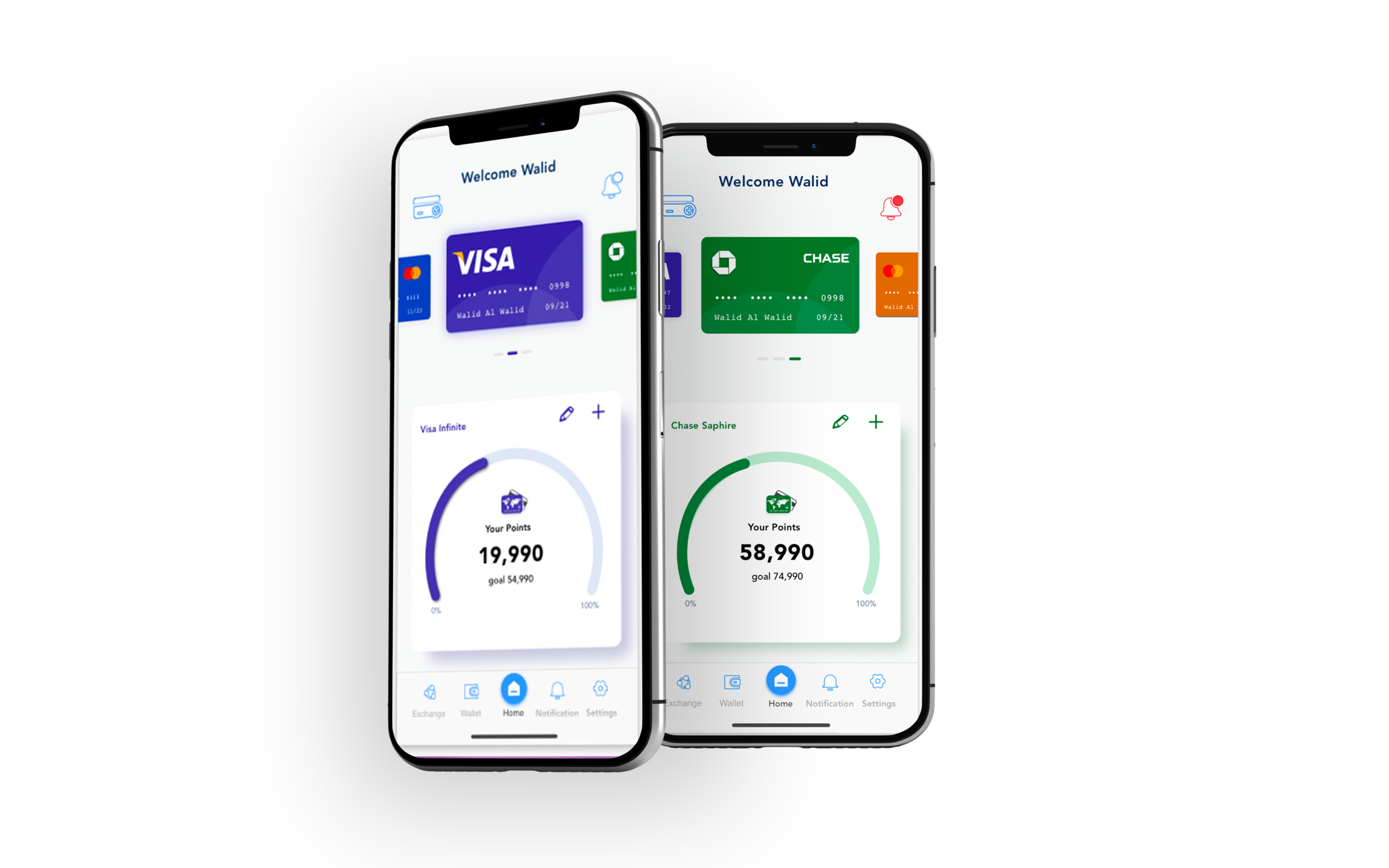
Evolution of Screens through User Tests 1, 2, and 3
Low Fidelity Version (after three rounds of testing)
// Visual Identity
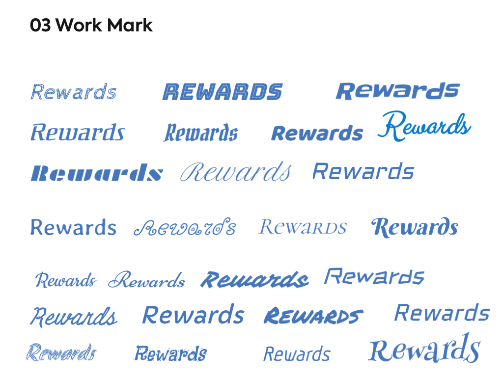
I started off by by ideating the name of the app.
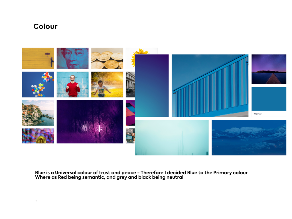
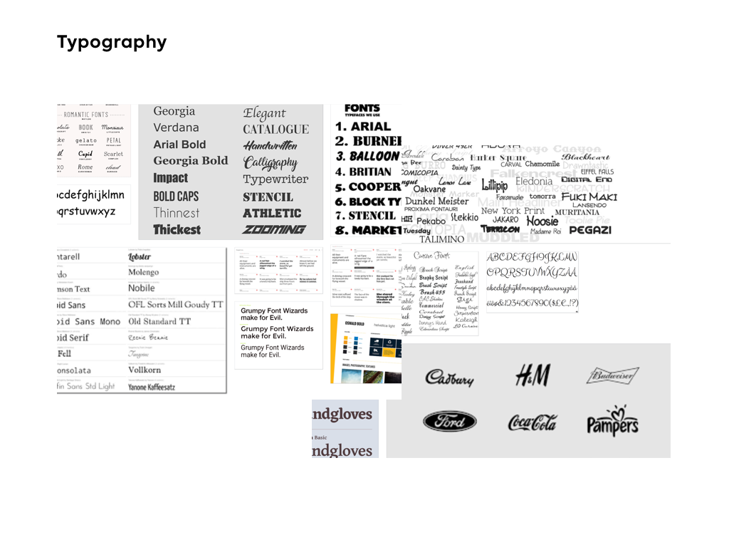
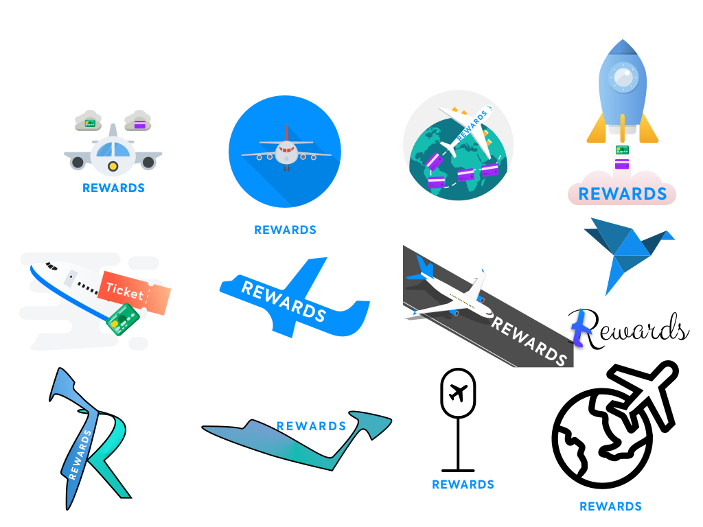
After picking the name, I tested it out in different styles. After going through over 30 font styles and gatherings lot of feedback from my peers, I decided on picking the font: Style Clicker Pro. The next step was to establish a visual identity for the app by drawing colours from the mood board I created. The feel I was going for was: trust, travel and fun. The following images show the visual design process, including the mood and inspiration boards for colour and typography.
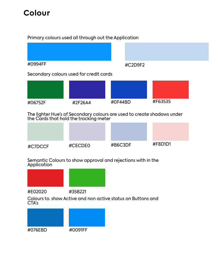
Injecting Colour - Design Decision
I wanted to a capture an edgy, modern and conventional feel to my design. Financial products can be very traditional looking, so I wanted to play with colour to assure the user that this is not the same old play on rewards, while assuring the user that this is a great product by having strong copy. Banking and money related applications or websites do not have to be traditional looking as long as they drive the value proposition. Shades of blue spoke to me and signified what I was going for. A rewards app has to be trustworthy, portray extravagance and also be creative, and the colour blue signifies all these elements.
After carefully reviewing the design interface guidelines set by Apple, a few changes were made to the prototype. I then did a few more rounds of user testing after Version 3, and as per the feedback I made the following change:
Hi Fidelity Prototype
// Marketing Website
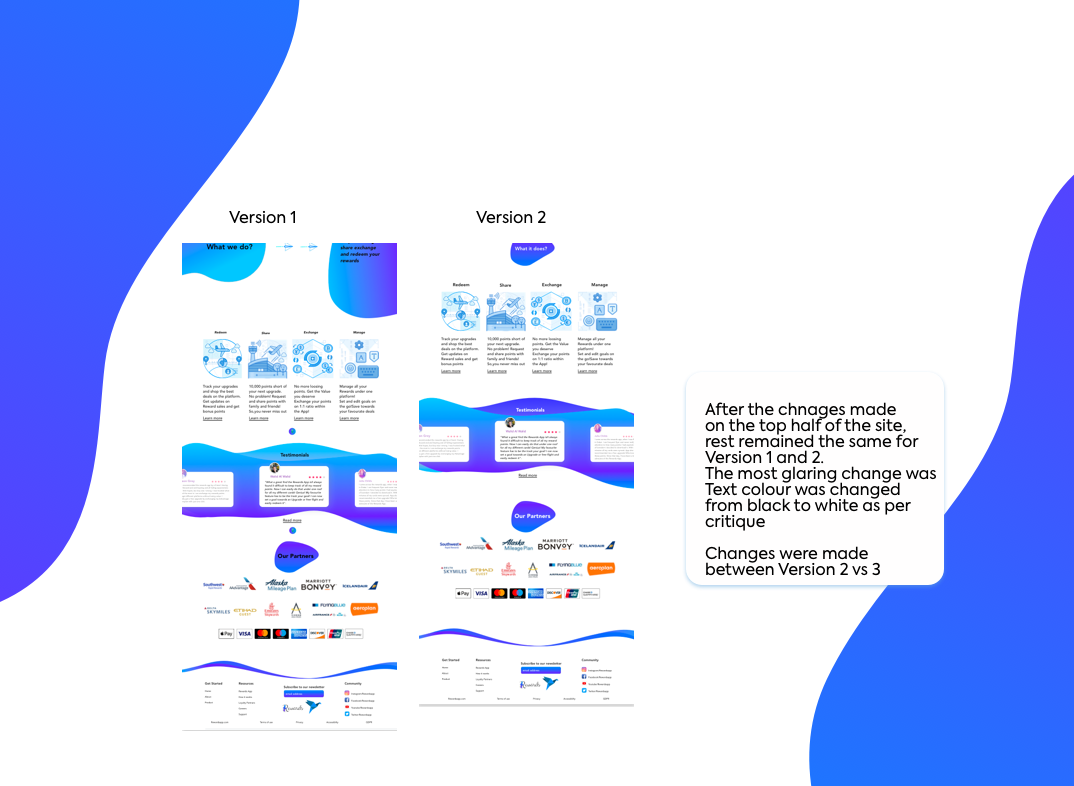
For the marketing website design, I incorporated various shapes in different colours. Shapes add dimension in the white space and their colours provide a good balance of contrast and saturation. The white background brightens these colourful shapes. In the decision process section you will notice I changed the use of shapes after gathering constant feedback from educators and my peers. Another key point of feedback was to not make the copy of the marketing website sound like a sales pitch but rather to drive the value proposition of managing, sharing and redeeming rewards by providing context with the use of visualization.
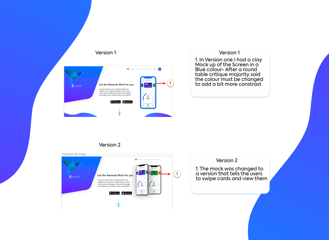
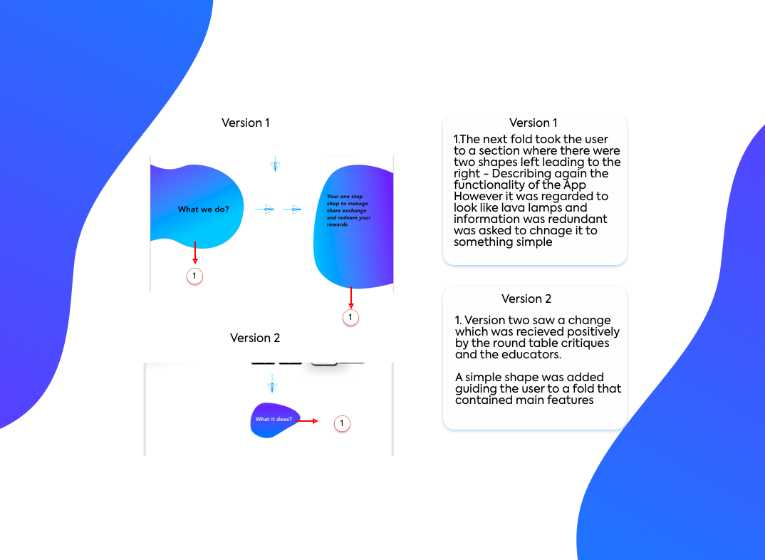
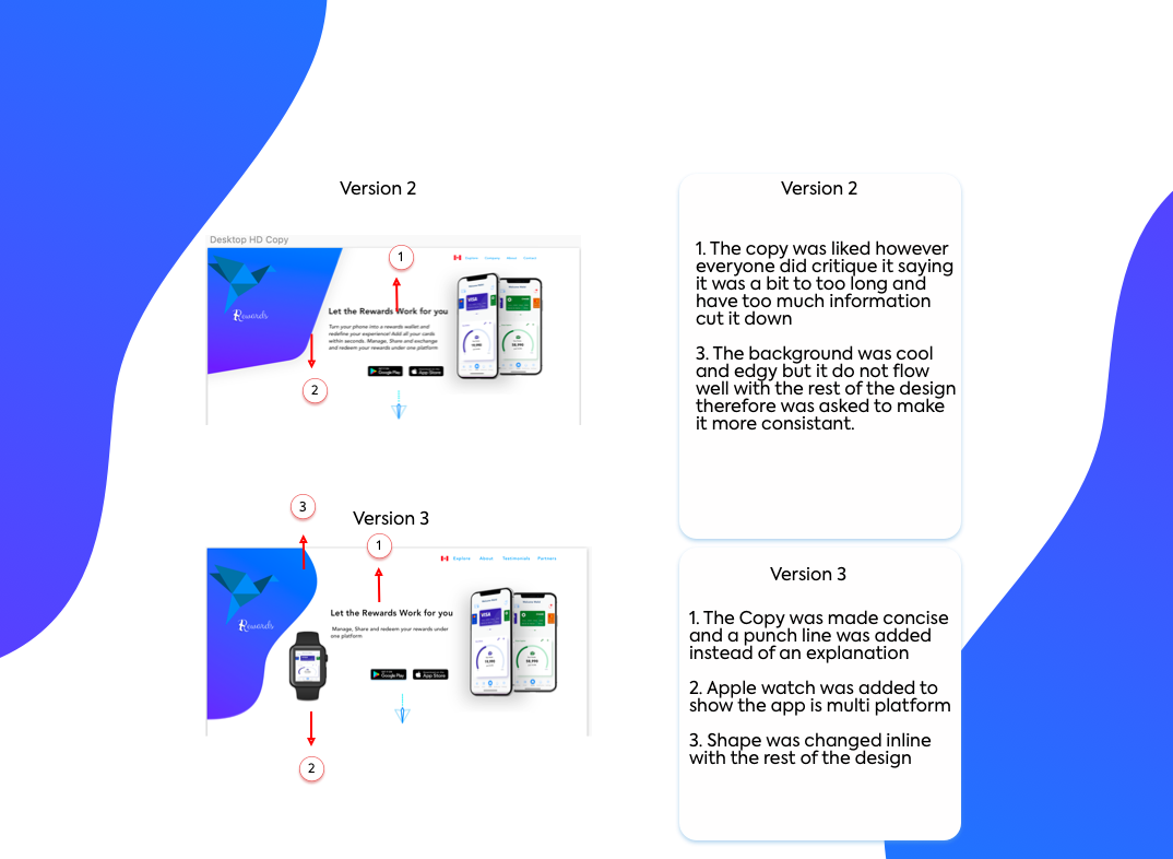
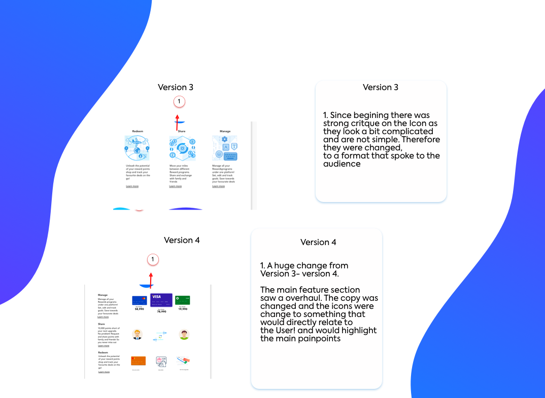
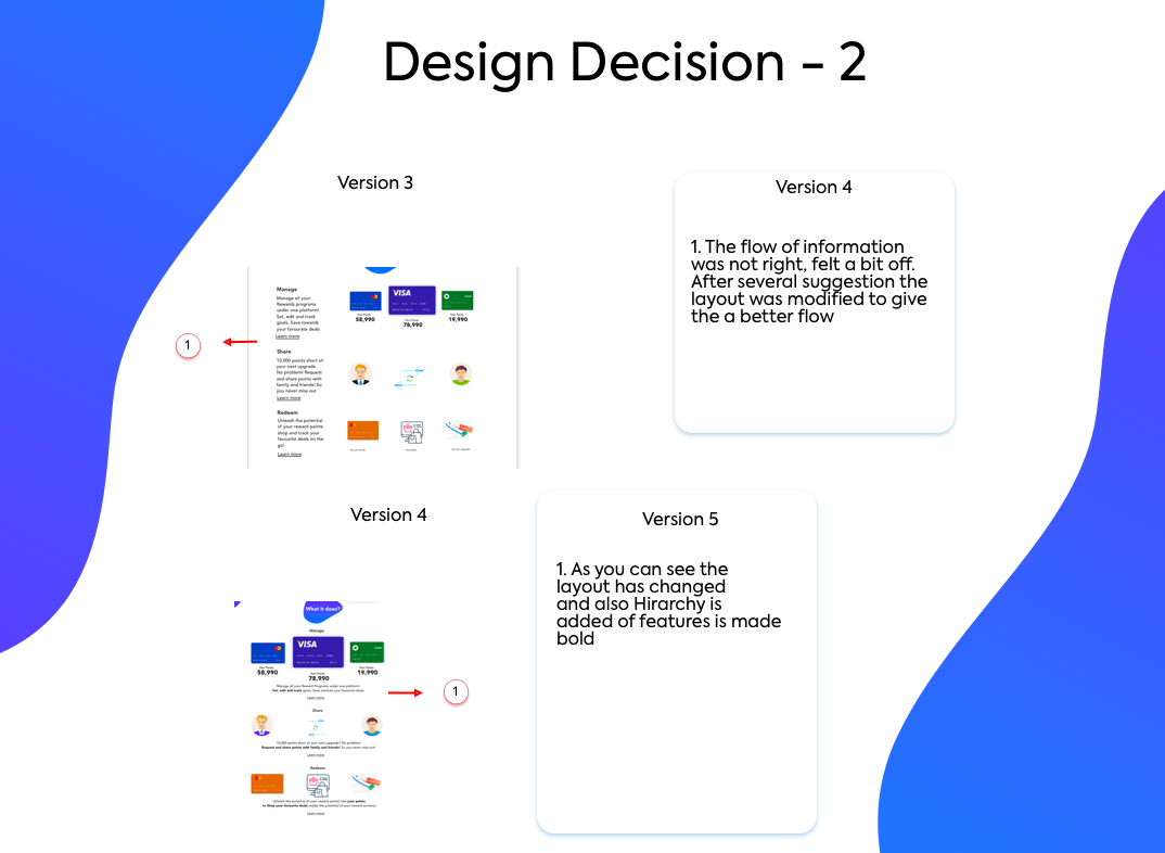
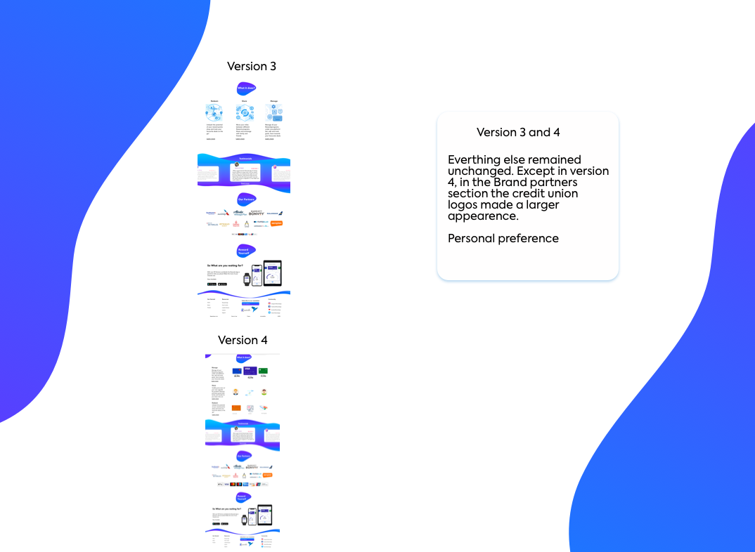
For colour I stayed true to the colour palette I had chosen with a play on hues of blue. The design process went through 5 variations with the biggest change occurring in Version 4. The process started with sketching a few ideas down, which I referred to throughout the process to build on ideas. The slideshow below shows different sketches and iterations.
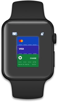
// Alternate Platform
We were given a challenge to translate our design to an alternate platform of choice. I choose the Apple Watch, as I found that from interviews, people had a preference for wearable tech. In the future, I plan to build a feature that would give users the ability to buy upgrades directly through the app.
// Design Impact & Future Thinking
The goal of this project was to meaningfully impact the experience of users and add value to their interactions through the Rewards App. What I learned was that the process is subjective, however all changed made should be driven solely by informed research and feedback.
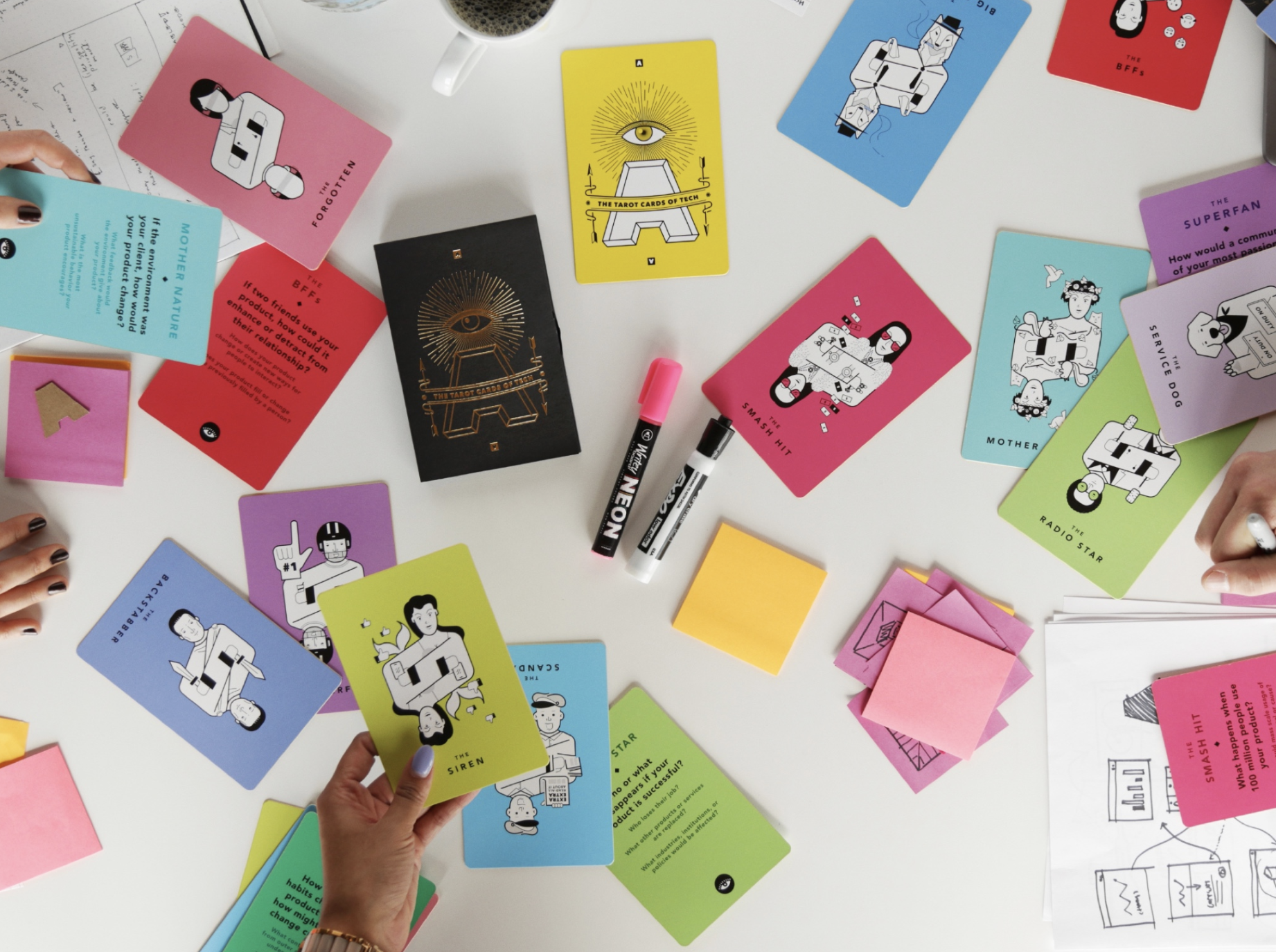
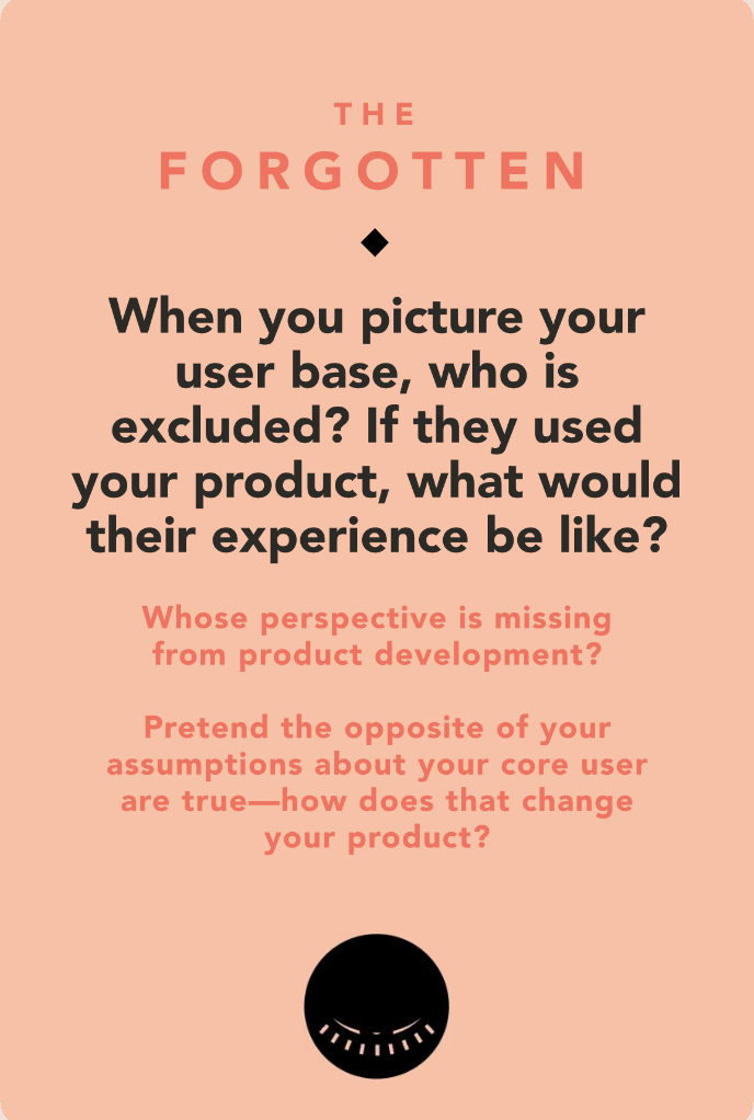
We did a fun activity to wrap up our case study, cycling Tarot Cards of Tech amongst one another. I received “The Forgotten” , which prompted me to look at the Rewards app from a different viewpoint, giving me a very interesting perspective.
Perspective 1
The Rewards app is heavily marketed and catered towards users in the West. As to point from my research findings Credit cards have been an integral part of the western society for decades now. Where as in the east such as countries like India, Indonesia, Thailand, Vietnam to name a few. The value of the credit card is not present as these societies have mainly been cash based societies. Over the last decade these countries have made huge surges in Fintech, introducing mobile paying applications such as Paytm where a user can just send money over a text message. Rewards points are very much western ideologies that have been part of the developed world. Therefore, if this App was introduced in any of the countries mentioned above it would be most likely be a failure and only be catered towards the upper middle class and the rich.
Perspective 2
Just the sheer population in Asia marks almost the 40% of the world. The App could do quite well. As there is a huge rise the middle class and the upper middle class. Globalization has impacted these countries in many positive ways that have empowered people to get an education and have the confidence to shape the future. In addition, a lot of big giants of Tech hold their bases in these countries after the silicon valley providing amazing opportunities. With a rise of income a lot the population is moving in to cities and these countries are adopting western ideologies. With just the sheer number of population per say, the App could have the potential to be very successful. However, there would definitely need modifications - such as add features similar to Wechat. Where a person can pay through app, track their spending, accumulate points etc. The demand for new technology is immense in the East, in many ways they just skipped the Industrial age and just adopted and transformed their economies by adopting to newer means.