
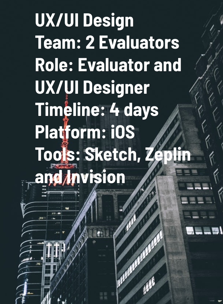
Introduction
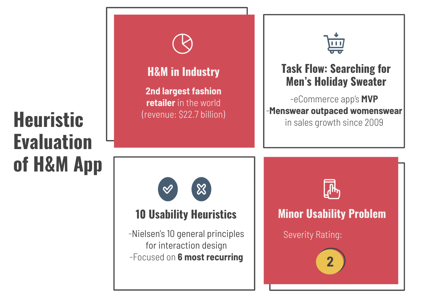
The H & M app has an amazing rating of 4.4 on the App store and the on the Play store. Being the second largest retailer by revenue and over 385,000 reviews we wanted to check whether the H & M app lives up to its rating in regards to Heuristics, going through the reviews, however one can still find dissatisfying reviews for the App
“Don't have an issue with the app but I do with the fact that you now have to pay via Klarna, they should never have partnered up with them, it's a absolute nightmare when you have an issue & have to go back & forth between two companies when you could of just spoken & sorted out the issue with h&m”. -
Lovedonthurt LST
“The app is a bit glitchy. Items kept disappearing from my cart not allowing me to come back and purchase on a later date. When I tried to checkout, the payment did not process for quite some time. Eventually it worked in third attempt and I was able to place my order. The size chart while picking out an item is quite confusing especially if you are purchasing coats/jackets and blazers”.
Avisha Sodhi
Given a few mixed reviews and we got a bit intrigued and decided to conducted a Heuristic Evaluation of the H & M app.
Overview
A Heuristic Analysis is an inspection methodology to evaluate a website using a number of evaluation criteria based on a broad set rules of thumb and not necessarily specific usability guidelines. This type of evaluation is usually done on an existing product, or it can be conducted at a later stage in the development of a new product to iron out usability issues before implementation. Keep in mind this methodology is not the same as Cognitive Walkthrough or Usability Testing — each plays a significant role in improving the usability of a product though.
A heuristic evaluation is a method for finding usability problems in a user interface design. They involve having a small set of evaluators examine the interface and judge its compliance with recognized usability principles (the "heuristics"). Nielsen & Molich, 1990; Nielsen, 1994
Evaluation criteria for this case study
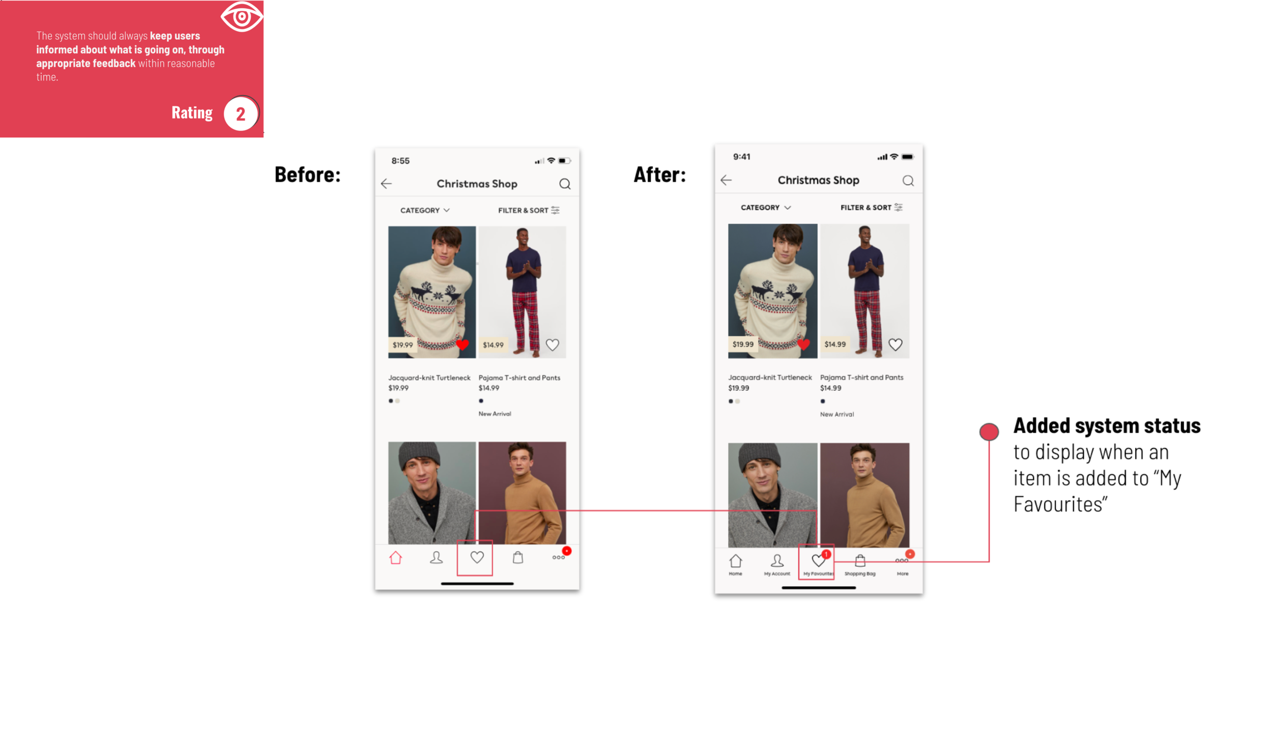
Visibility of system status '
The system should always keep users informed about what is going on, through appropriate feedback within reasonable time.
Match between system and the real world
The system should speak the users’ language, with words, phrases and concepts familiar to the user, rather than system-oriented terms. Follow real-world conventions, making information appear in a natural and logical order.
User control and freedom
Users often choose system functions by mistake and will need a clearly marked “emergency exit” to leave the unwanted state without having to go through an extended dialogue. Support undo and redo.Consistency and standards
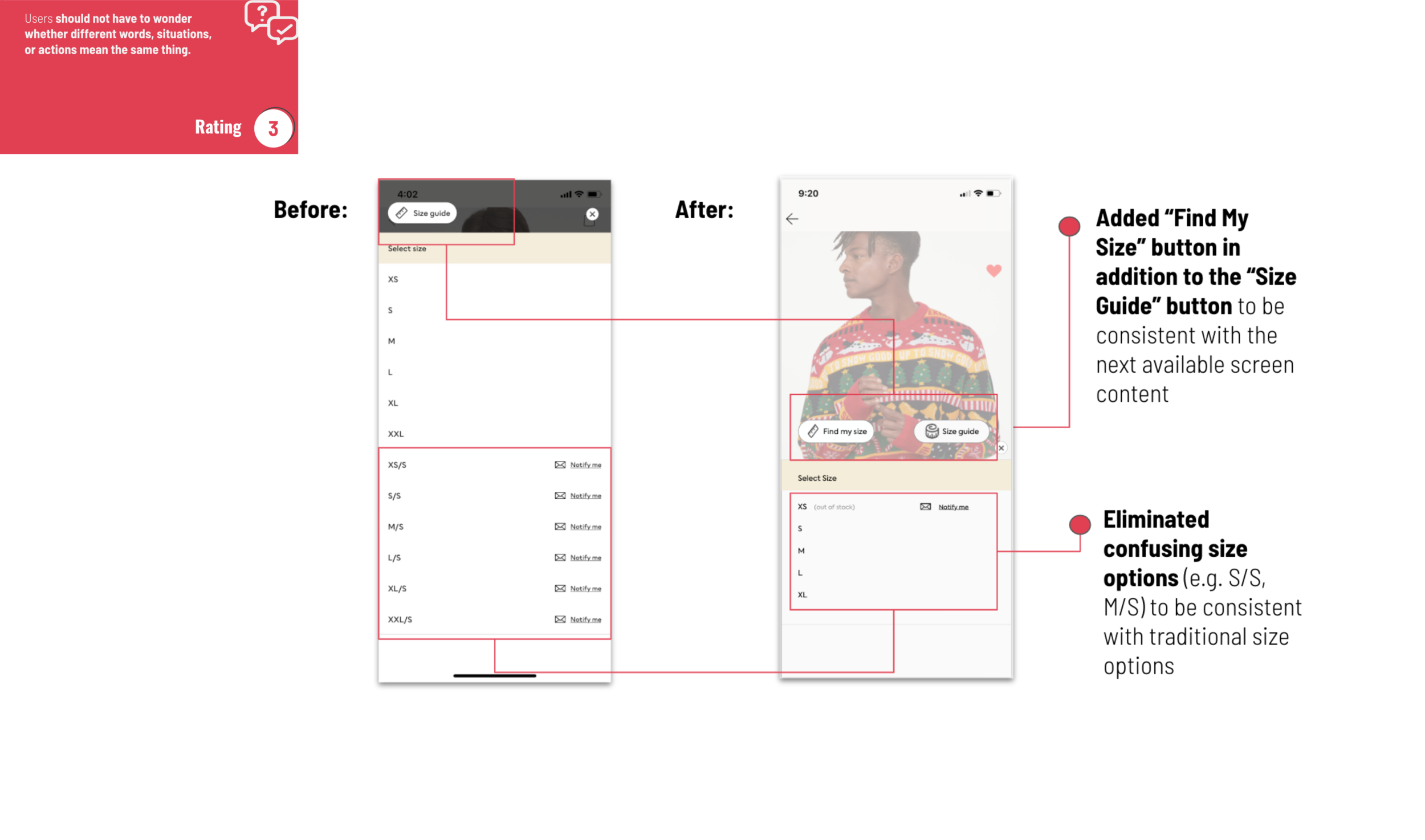
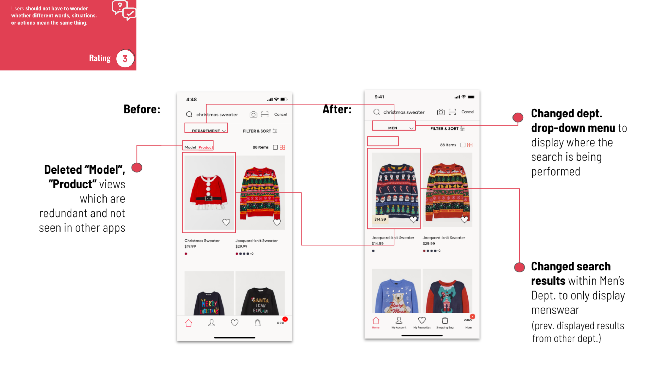
Users should not have to wonder whether different words, situations, or actions mean the same thing.Error prevention
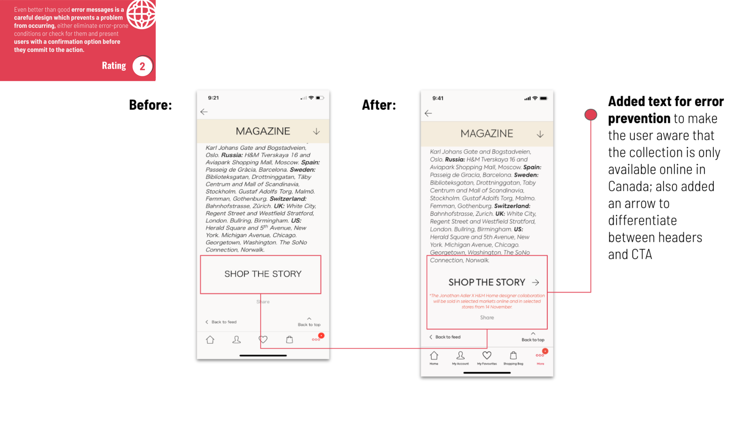
Even better than good error messages is a careful design which prevents a problem from occurring in the first place. Either eliminate error-prone conditions or check for them and present users with a confirmation option before they commit to the action.Recognition rather than recall
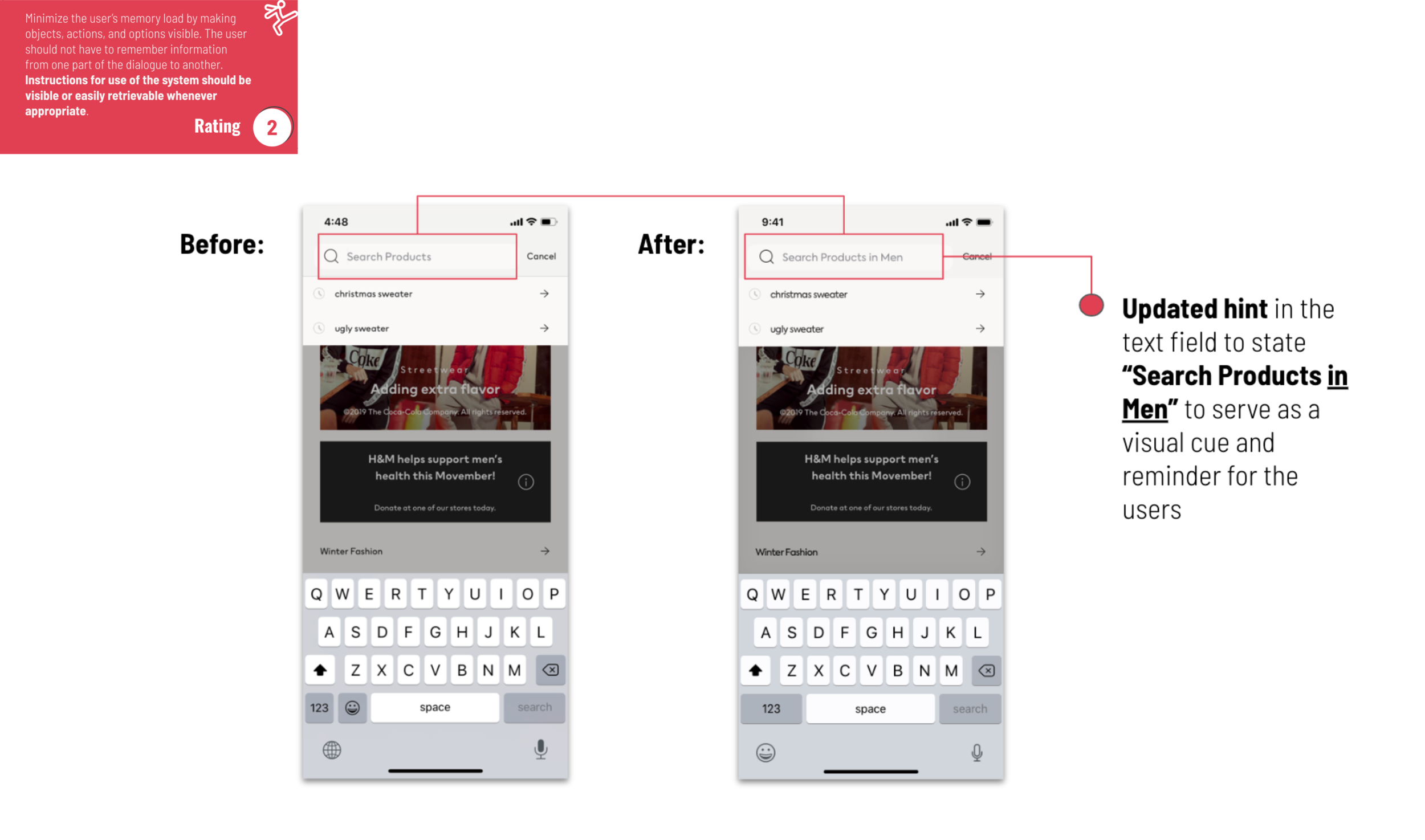
Minimize the user’s memory load by making objects, actions, and options visible. The user should not have to remember information from one part of the dialogue to another. Instructions for use of the system should be visible or easily retrievable whenever appropriate.Flexibility and efficiency of use
Accelerators — unseen by the novice user — may often speed up the interaction for the expert user such that the system can cater to both inexperienced and experienced users. Allow users to tailor frequent actions.Aesthetic and minimalist design
Dialogues should not contain information which is irrelevant or rarely needed. Every extra unit of information in a dialogue competes with the relevant units of information and diminishes their relative visibility.Help users recognize, diagnose, and recover from errors
Error messages should be expressed in plain language (no codes), precisely indicate the problem, and constructively suggest a solution.Help and documentation
Even though it is better if the system can be used without documentation, it may be necessary to provide help and documentation. Any such information should be easy to search, focused on the user’s task, list concrete steps to be carried out, and not be too large.
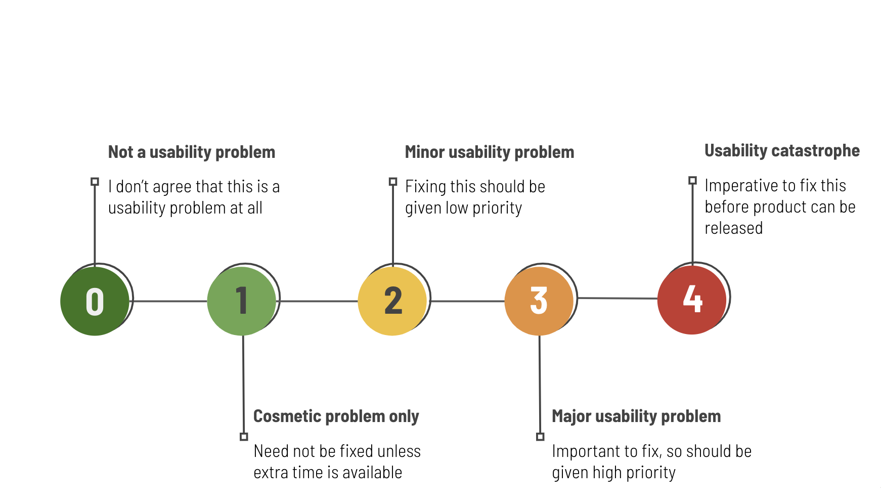
Metric System
Rating the severity of a problem is less objective than finding the problem frequency. There are a number of ways to assign severity ratings. I’ve selected most more popular approach described in the literature, and I’ll contrast those with the method we use at Measuring Usability.
While there are differences in approaches, in general each method proposes a similar structure: a set of ordered categories reflecting the impact the problem has on the user, from minor to major. These ratings are are a combination of frequency, impact and persistent of the problem. Each heuristic evaluation criteria is scored from the medium of the score per relevant screen on a scale of 0 to 4 as shown.
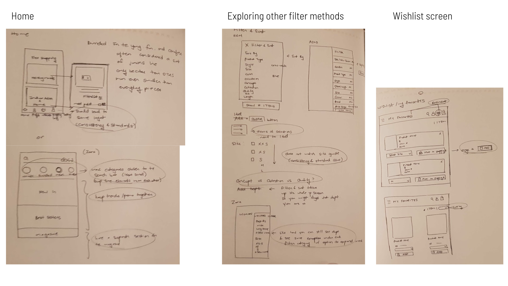
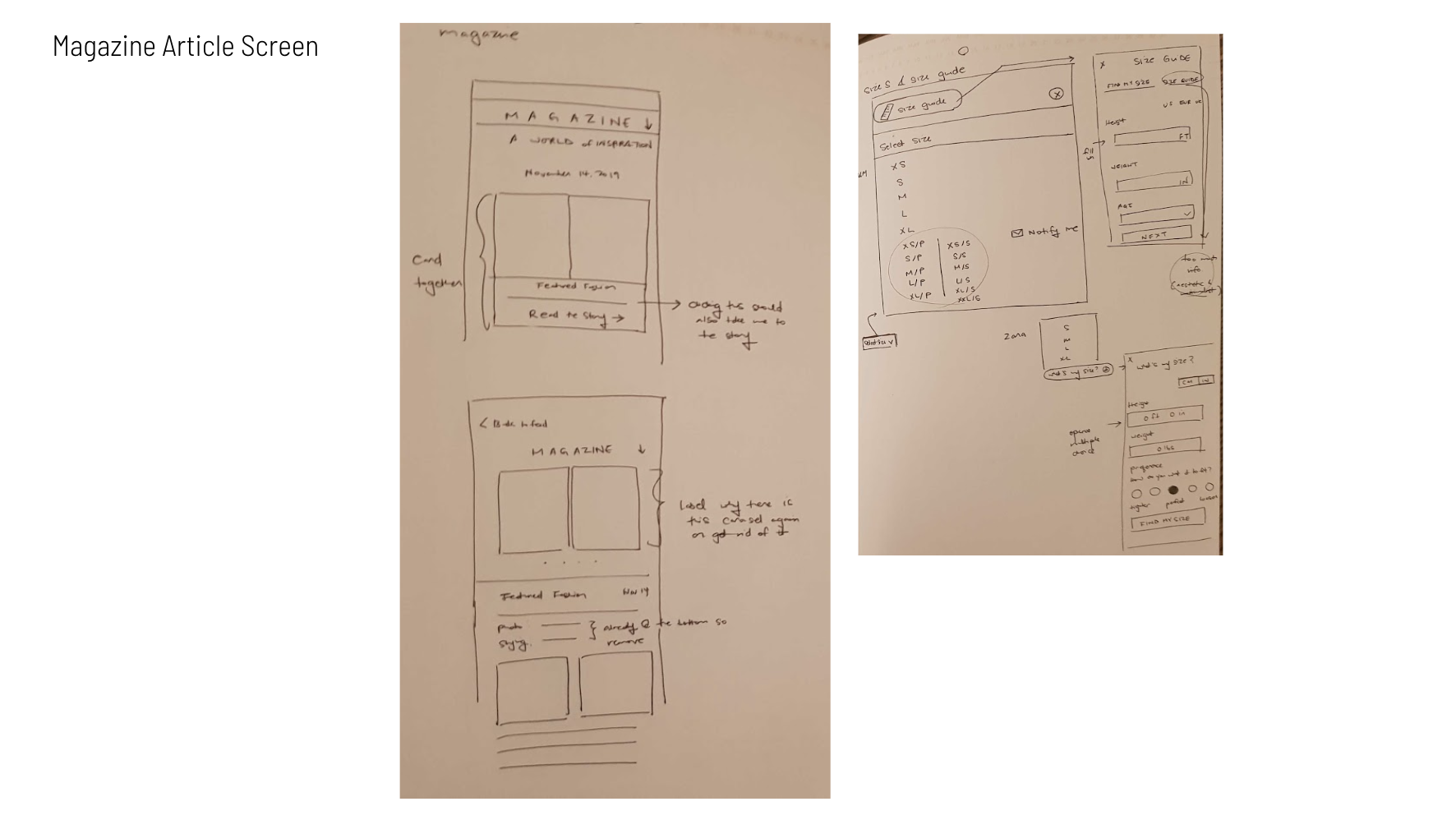
Sketches and Ideation
As we started evaluating the App, in order for us to show recommendations we had to redesign the screens, before we got onto redesigning the screens we started sketching making sure that we kept our Heuristic criteria in mind in mind.
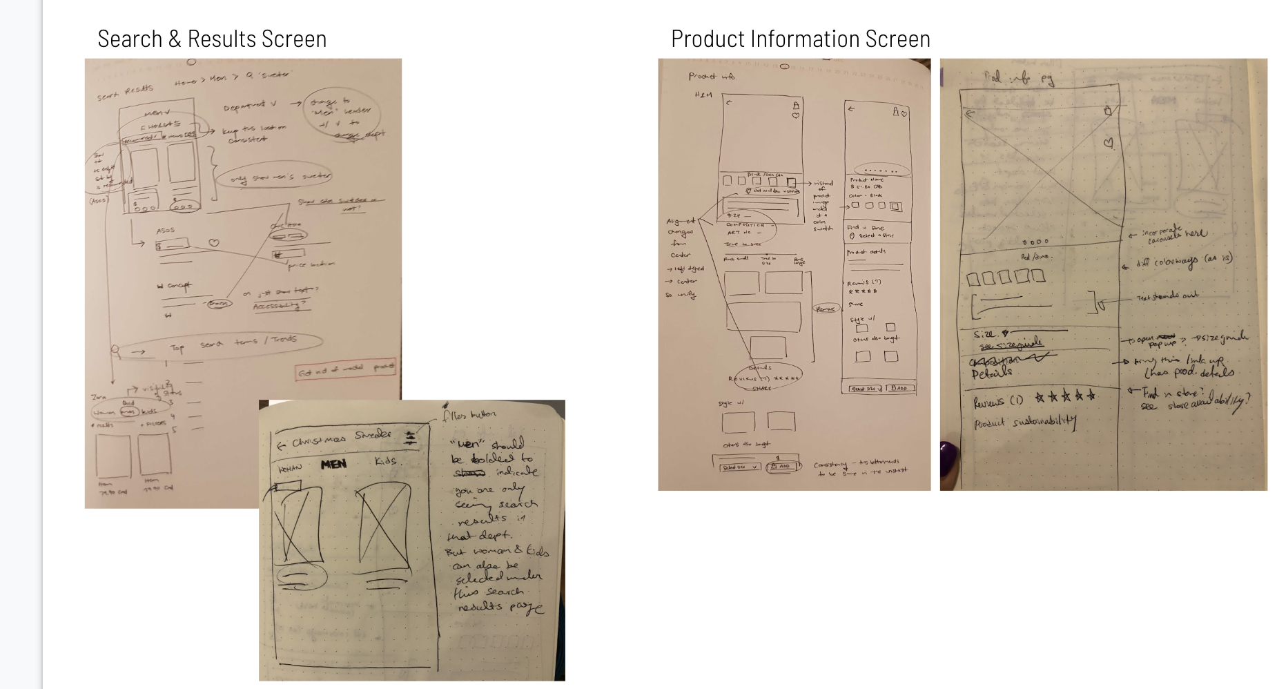
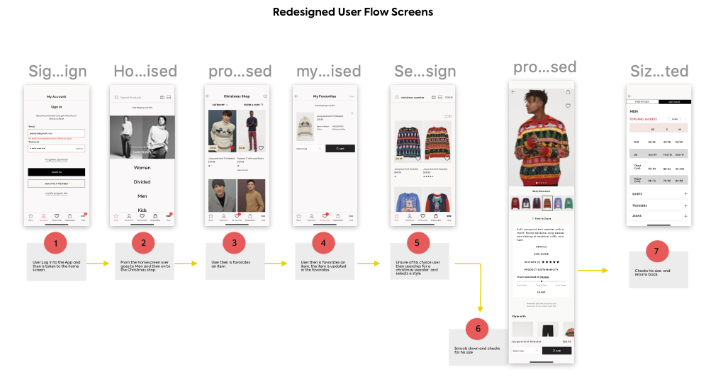
User Flow
Below is the Representation of the User flow - We wanted to select a simple task of selecting a christmas sweater. The screens are re designed,original screens will follow with the evaluation
Heuristics Evaluation Process
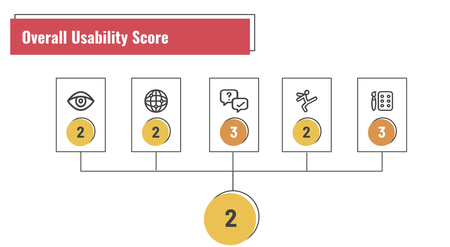
Among all Jakob Nielsen’s Usability Heuristic principles, I decided to focus on #1.Viability of system status, #4. Consistency and Standards #5. Error Prevention, #6. Recognition rather than recall and #8. Aesthetic and minimalist design. After thoroughly evaluating I allocated a score for each of the 5 chosen heuristics.
Visibility of System Status
Evaluation: - No system status change when items are added to the wishlist.
Recommendation: Display system status change for the wishlist
4. Consistency and Standards
Evaluation: Confusing sizing options (i.e. S/S, XL/S, XXL/S) and Empty Size Guide page and views which are redundant and not seen in other apps
Recommendation: Correct size offerings and Fill in Size Guide information and changed dept. drop-down menu to display where the search is being performed and Changed search results within Men’s Dept. to only display menswear
5. Error Prevention
Evaluation: The magazine page was missing critical information about a new collection being launched
Recommendation: Added text for error prevention to make the user aware that the collection is only available online in Canada; also added an arrow to differentiate between headers and CTA
6. Recognition rather than Recall
Evaluation: Even though the user is in the men’s category the app does not show that products are being searched in Men’s and pulls up entire store when searching an item.
Recommendation: Updated hint in the text field to state “Search Products in Men” to serve as a visual cue and reminder for the users
8. Aesthetic and minimalist design
Evaluation: Searching in Men’s department yields results from all departments and Creates confusion and the lack of product description does not help
Recommendation: Eliminate irrelevant search results and match content with task and Add helpful product description

Overall score
After going through all the Heuristics we gave it an overall score of 2. We were quite surprised as the rating of the App were really high, However we must add it is better than a lot of competitors such as Zara etc. One other great thing we noticed was everyday we would see an update on the screen and it showed that the H & M design and dev team were committed to solving overall problems. Over all below of a few recommendations.
Reduce user confusion by improving on:
Visibility of system status
Progression of task flow
Add clarity and improve on consistency by:
Adding labels
Revising content text
Reduce users’ cognitive load by:
Eliminating unnecessary screens
Improving on information architecture
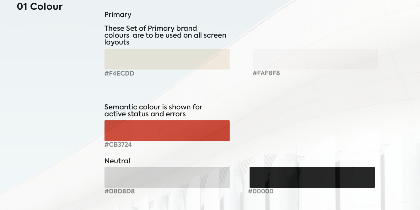
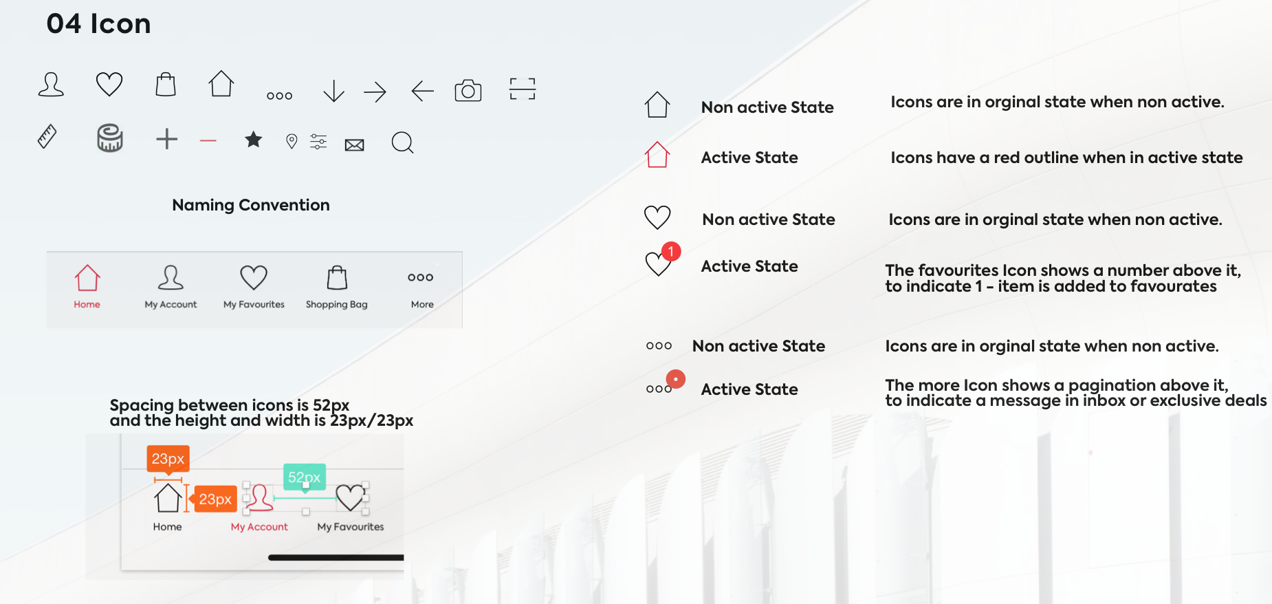
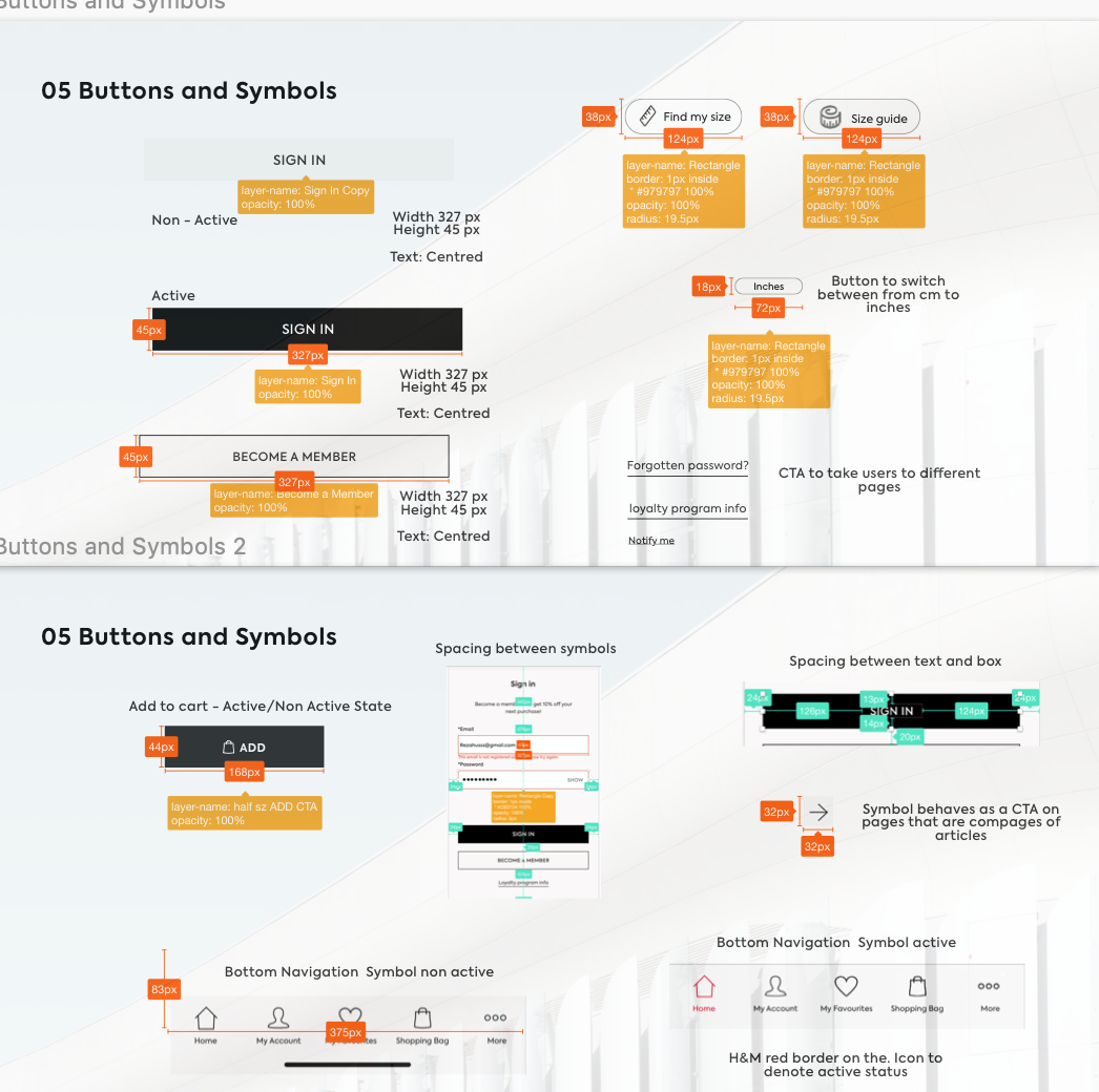
Design Constraints - UI Library and Prototype of redesigned screens
As I understand a library dedicated to building and documenting visualized patterns based on atomic designs – one will increase digital efficiency by simply synchronizing your existing UX repository to a central hub that any team can use and understand. Therefore when redesigning the screens, It was important to work within established design constraints of typography and colour. I studied all UI elements of the screens and identified the branding elements including the colour pallet, the typography, gridding and layout, padding and spacing, photo and image characteristics, buttons, fields, etc. and made a UI library for the app. Anyone interested in checking out the UI library can click on the button below

Next Steps
We compiled all the information and removed any duplicates and combined all similar issues. What was left was a set of problems that was addressed to improve H & M App usability. We made sure to clarify every problem that we as evaluators identified – and asked questions so that we and our audience understood the specific nature of the difficulties that one might encounter. We received excellent feedback and we also identified that H & M was very swift to always be on top on addressing these issues and updating their App. We would someday love to do go back and redo this evaluation to see if we encounter the same issues.
Thank You!
Let’s Connect! If you enjoyed reading this case study and have more questions about my process drop me a line here