Understand
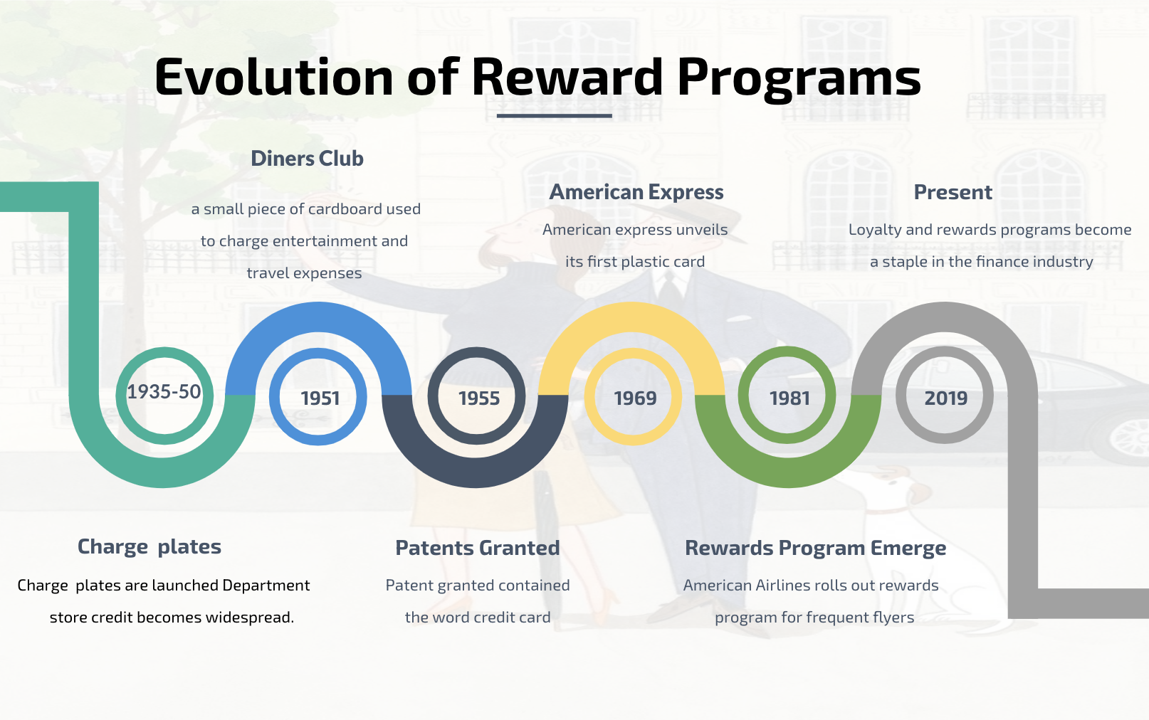
Rewards programs are part of the fibre of western economy. They are woven through both the wrap and the weft. Over time they have become both pervasive and popular. In fact, it is hard to imagine a scenario in which consumers do not expect rewards including for travel, shopping, grocery and airlines. The problem I explored was how often users redeem these rewards and if so what can be done in order to help these individuals or families. Having the problem in mind, I set out to research and what I found put a was a majority of the users do not even end up redeeming their rewards, often not realizing the value. A staggering 47% of users forget to redeem their rewards. 38% of millennials cash in rewards at a higher rate compared to boomers. Users usually end up forgetting how many miles they have acquired, and not truly understanding the value, they often letting miles expire without redeeming them. Below is an indication on how reward programs drive up the average spending amount, and the percentage of consumers who belong to rewards programs per sector.
Process
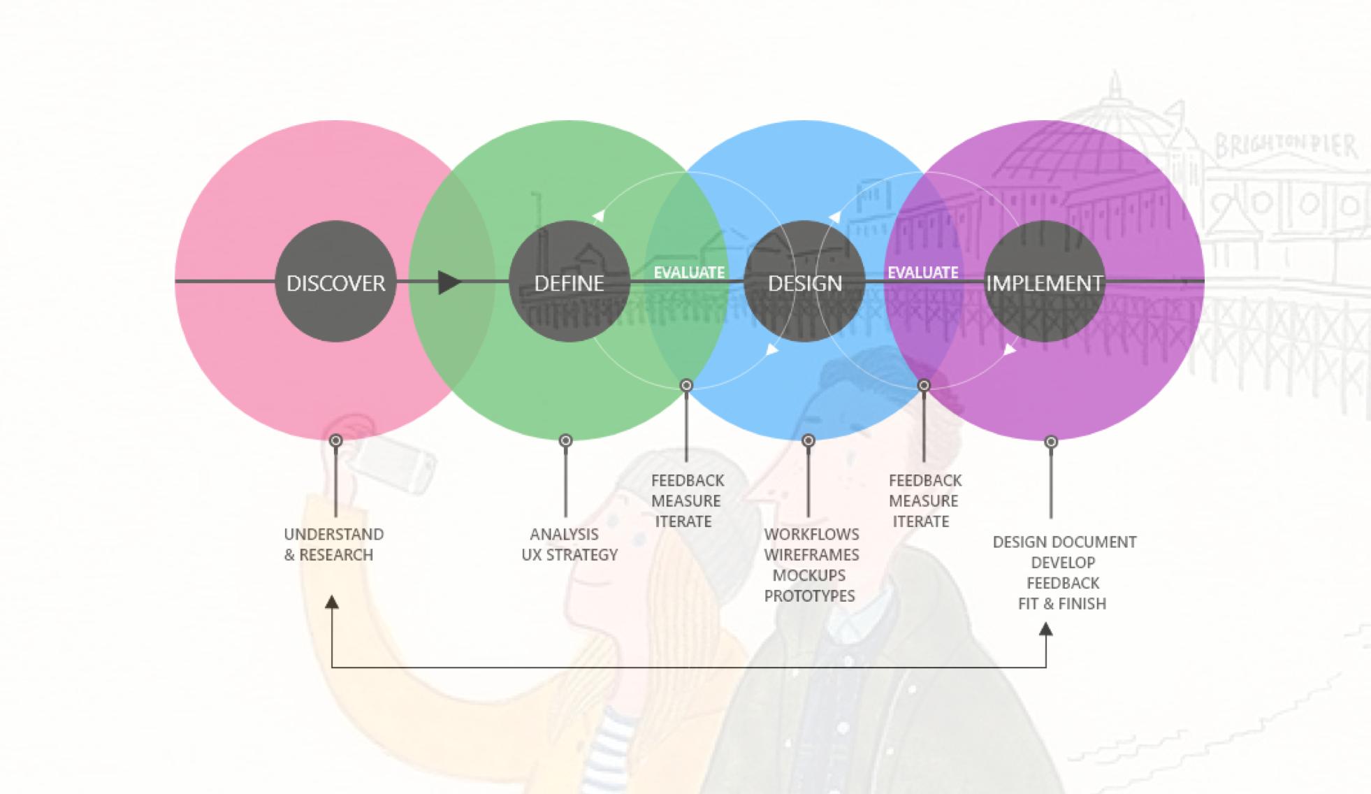
Discover
Let’s take a look at the evolution of credit cards, with a simple glance an assumption can be made that the biggest draw for credit card is the association of a Loyalty program. Loyalty programs vary from Airline, Retail, Grocery, and Gasoline.
Credit card and rewards program drive up sales. The average amount monthly spend on non rewards card was $333 vs $800 for rewards card holders.
“Rewards programs are part of the fibre of western economy. They are woven through both the wrap and the weft. Overtime, they have become both pervasive and popular. Infact, it is hard to imagine a scenario in which consumers do not expect rewards including for travel, shopping, grocery and airlines. ”
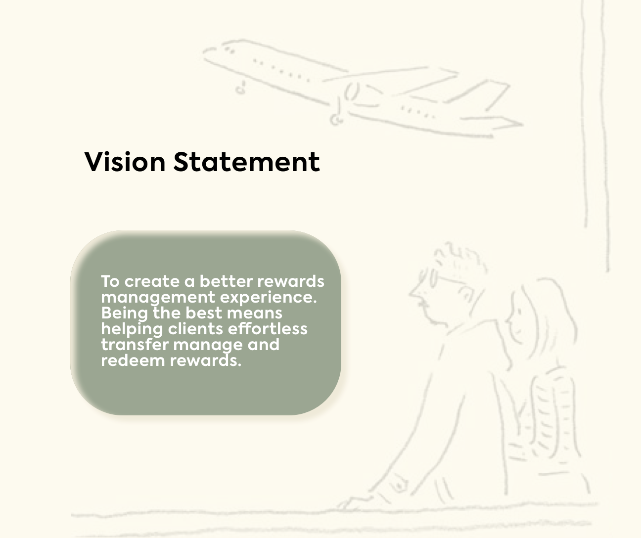
After doing secondary research I was certain that there is an opportunity for a design intervention here. I set out to explore and refine my focus for my solution, and wrote down a vision statement
Interview Themes & Insights
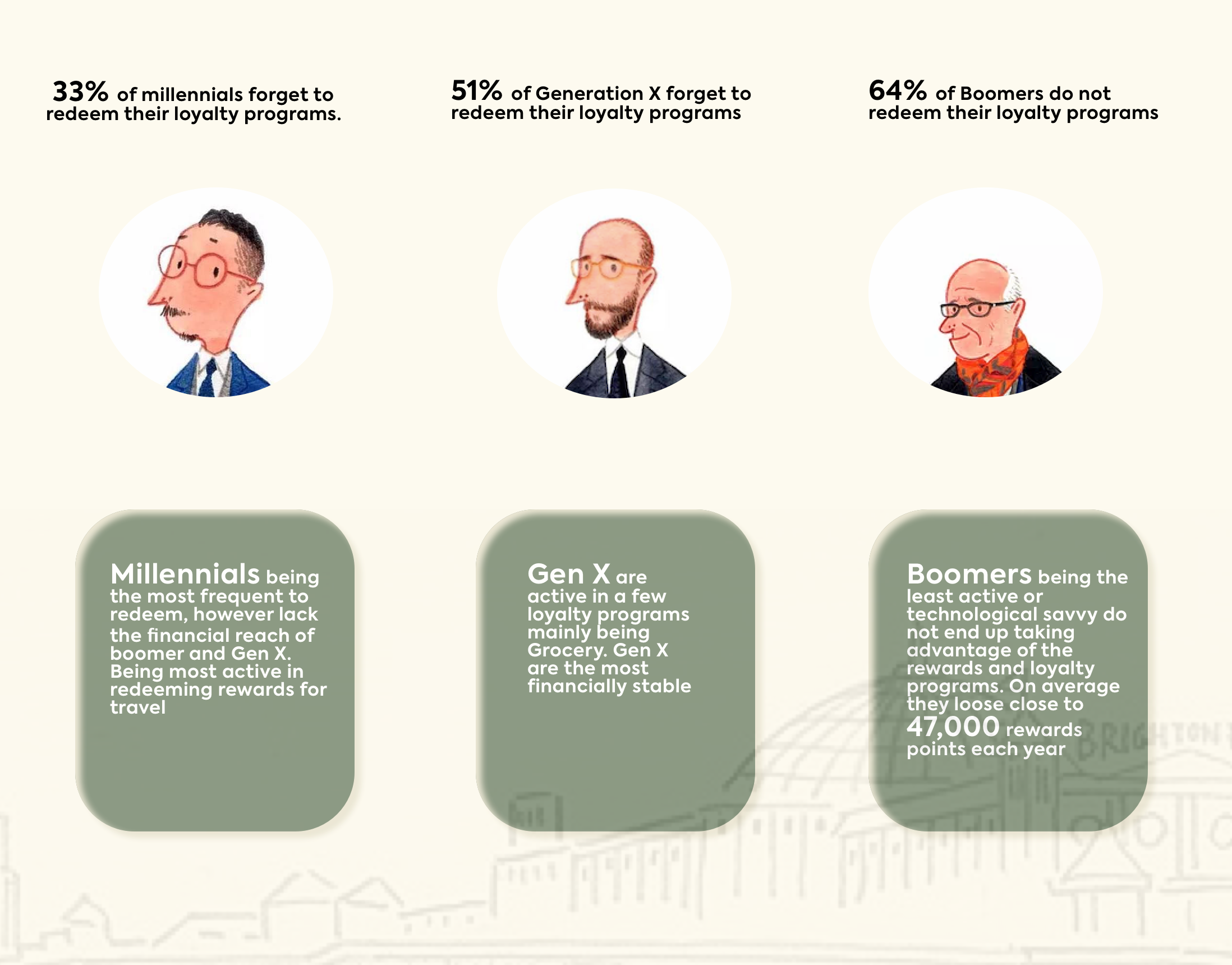
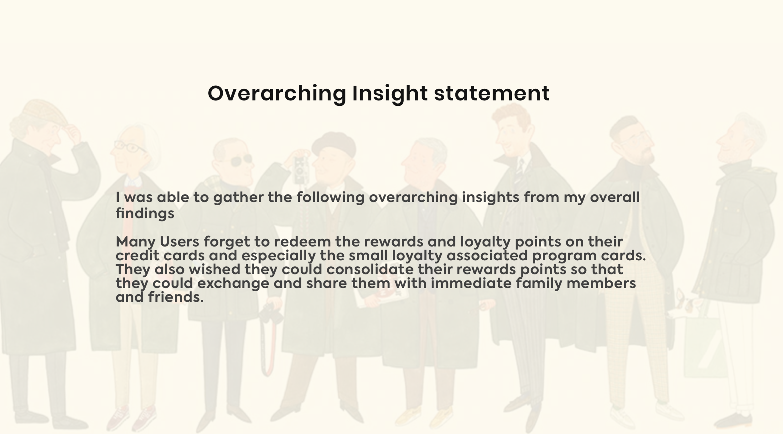
Next step was to talk to people and clear my assumptions so I conducted 8 in-person interviews and gathered information from six anonymous online surveys to gain further insight. After analyzing the raw data, I identified key pain points, motivations and behaviours that translated into the following themes:
Forgetfulness: I forget to redeem my reward points and thus lose out on it
Frustration: I was frustrated that I would forget to exchange and redeem the points that I had accrued
Unify: I wish I could unify all my points on one common card.
Afraid: I was afraid that I would forget to redeem points before expiry or closure
Hard: It is difficult/Hard to keep track of all my rewards and loyalty programs. Specially the smaller ones
Tedious: I feel process of switching rewards and loyalty points from card to another is very long
My next step was to establish a design question
How might we refinement
Redeem: Help individuals redeem their rewards so that they do not end up forgetting
Manage: Help people manage their loyalty programs so they make the most of it
Exchange: Help people exchange their loyalty points amongst family and friends so they benefit from sharing
After going over scenarios I finally settled with
“How might we help families manage all their earned rewards from various providers so they do not go to waste ”
Persona and Experience Map
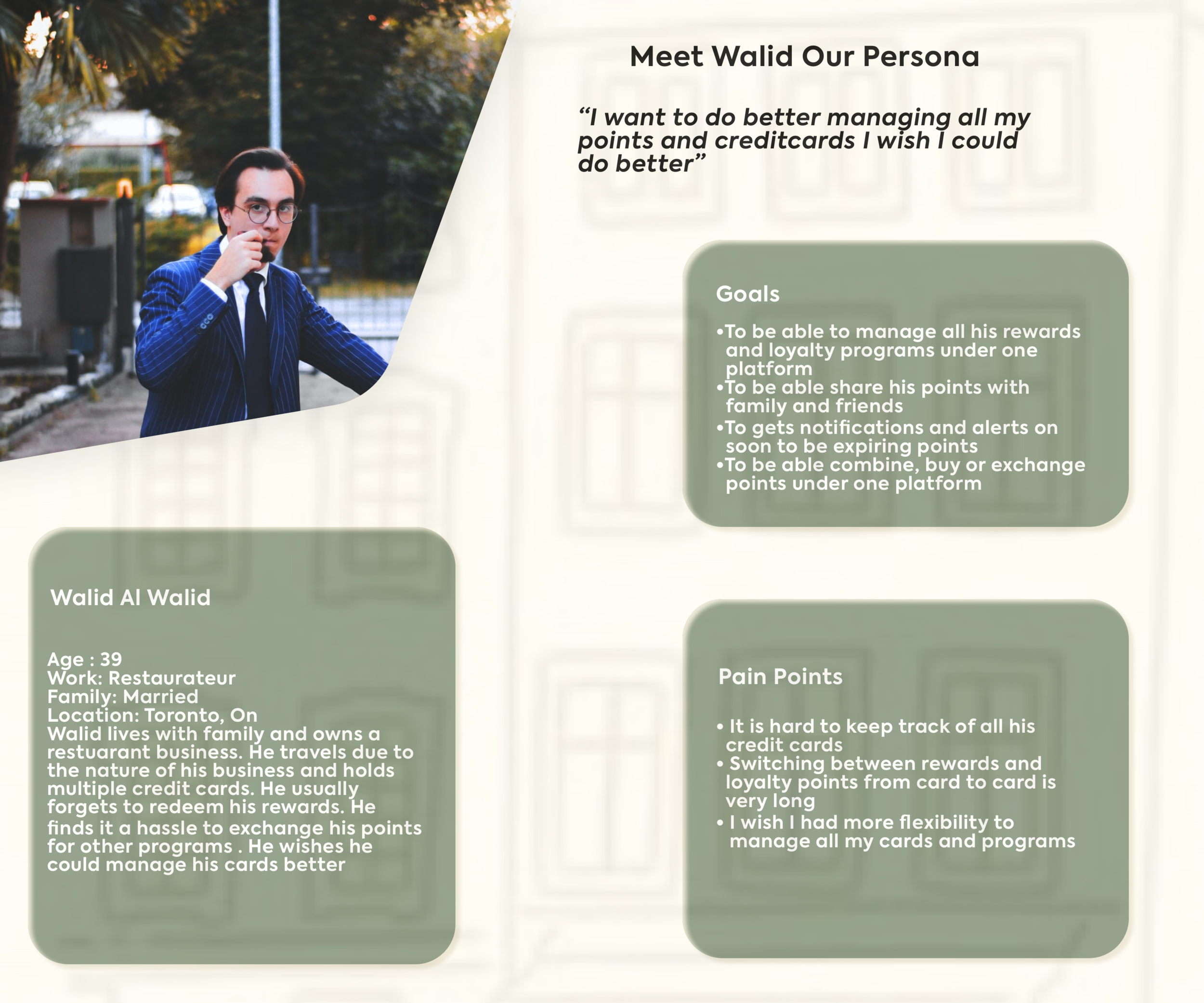
Based on the insights I gathered, I created an experience map, describing my Walid’s journey trying to change his reward points from one program to the other. I documented all the ups and downs of the emotions and feelings that Walid went through.
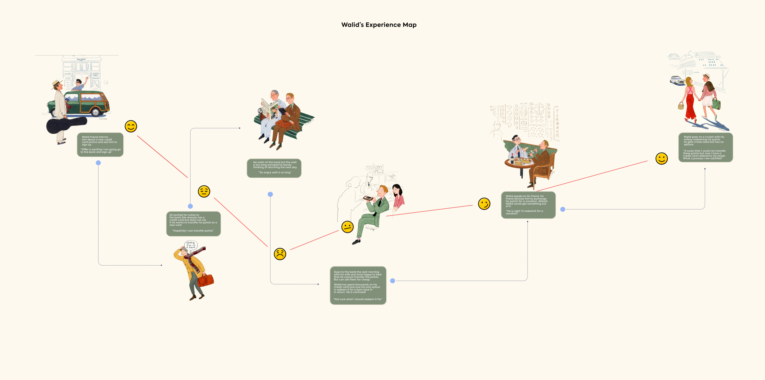
Click on the image to enlarge
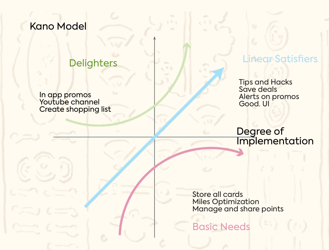
Market Research
Before I dove deep in ideating I wanted to take a look at the market and see my competitors. On the right is the Kano Model
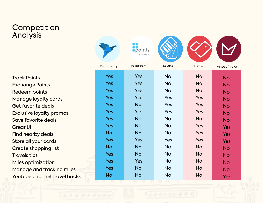
One might confuse the rewards app to be something similar to Drop, Rakuten or Carrot, where the user receives rewards based on taking an Uber ride or eating at a restaurant/ shopping (Drop and Rakuten) or is awarded rewards points based on ones active lifestyle (Carrot).
Below you’ll find true market competition
Value Proposition
Next step I penned down the app Unique Value Proposition that sets the Rewards app apart from competition.
“Easily manage and move reward points. Share with family and redeem hasslefree”
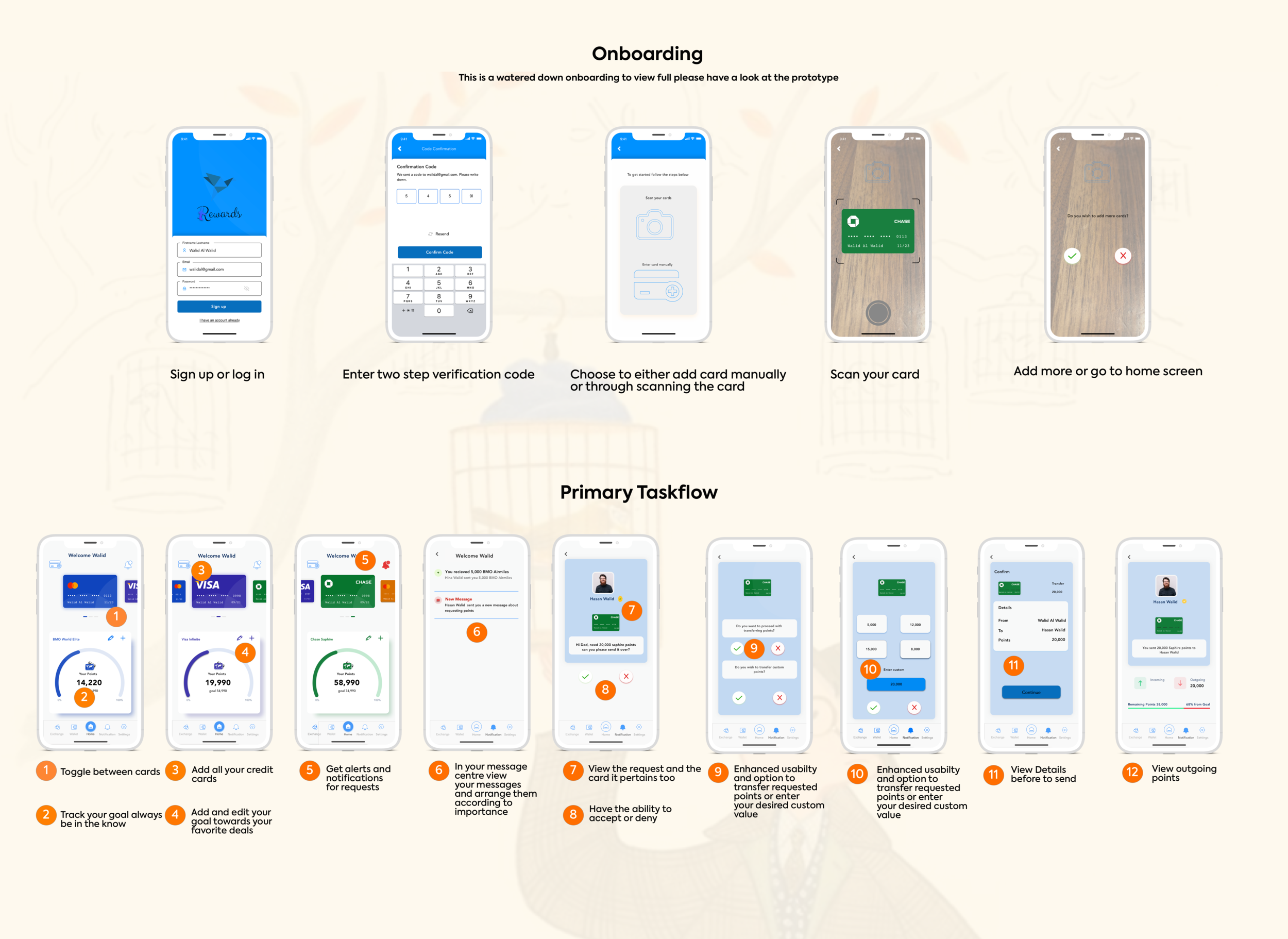
Task flow, User Stories and Sketching
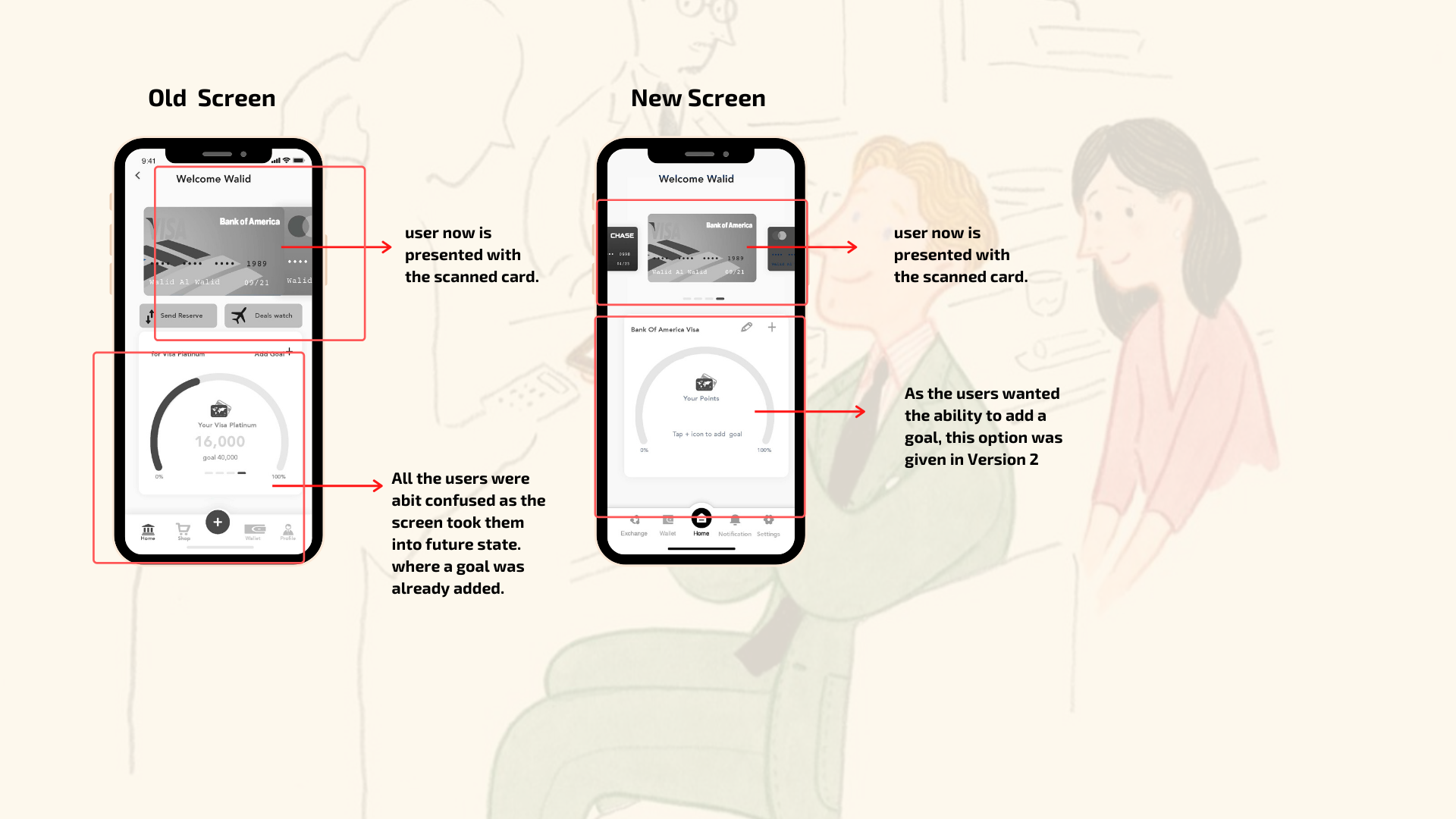
The next step was to write down User stories and after that I went ahead and created two task flows. The primary task flow entailed that the user receives a points transfer request from his son and transfers those points over. The secondary task flow involves the user adding a credit card using the built-in camera function or the search card feature.
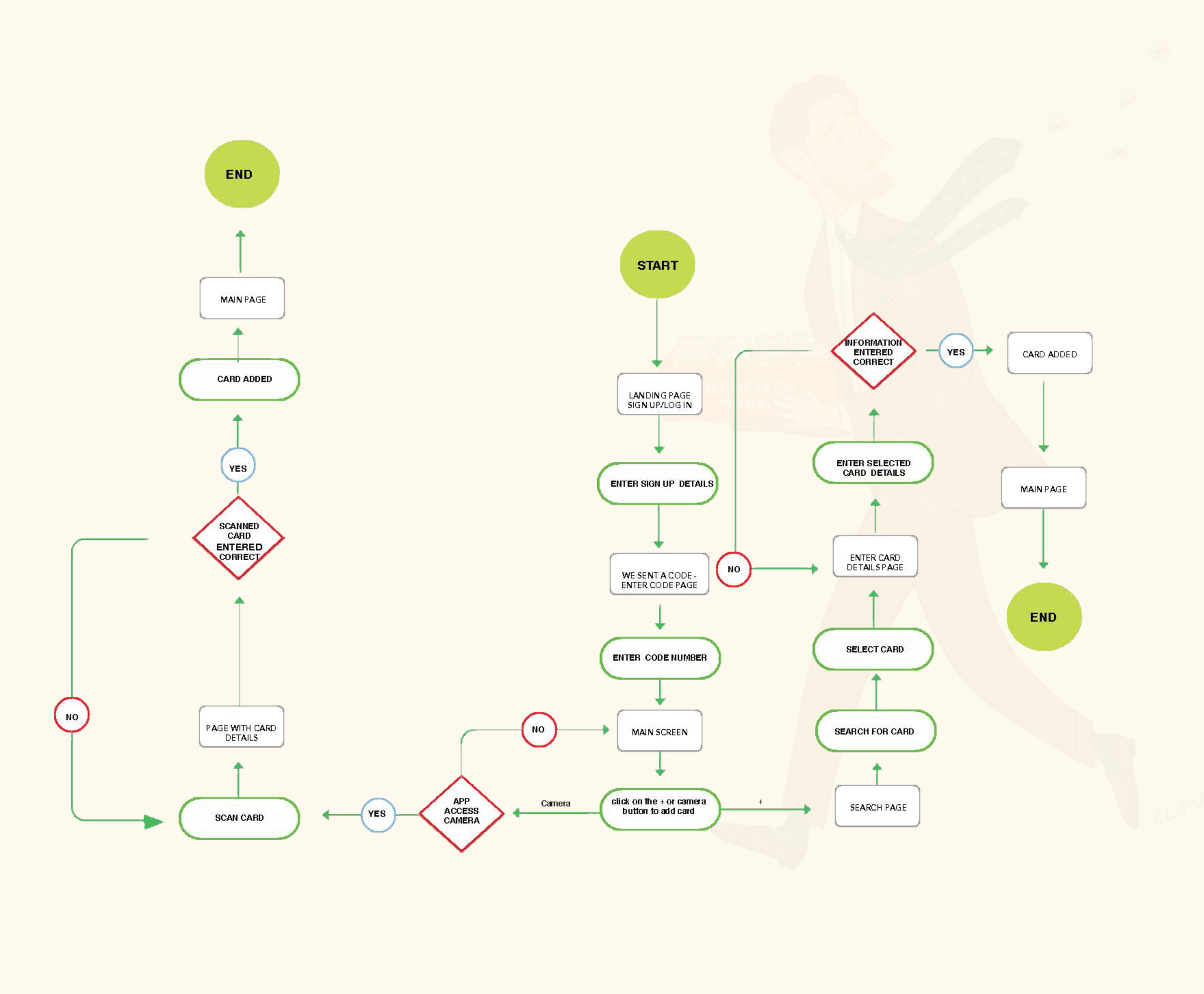
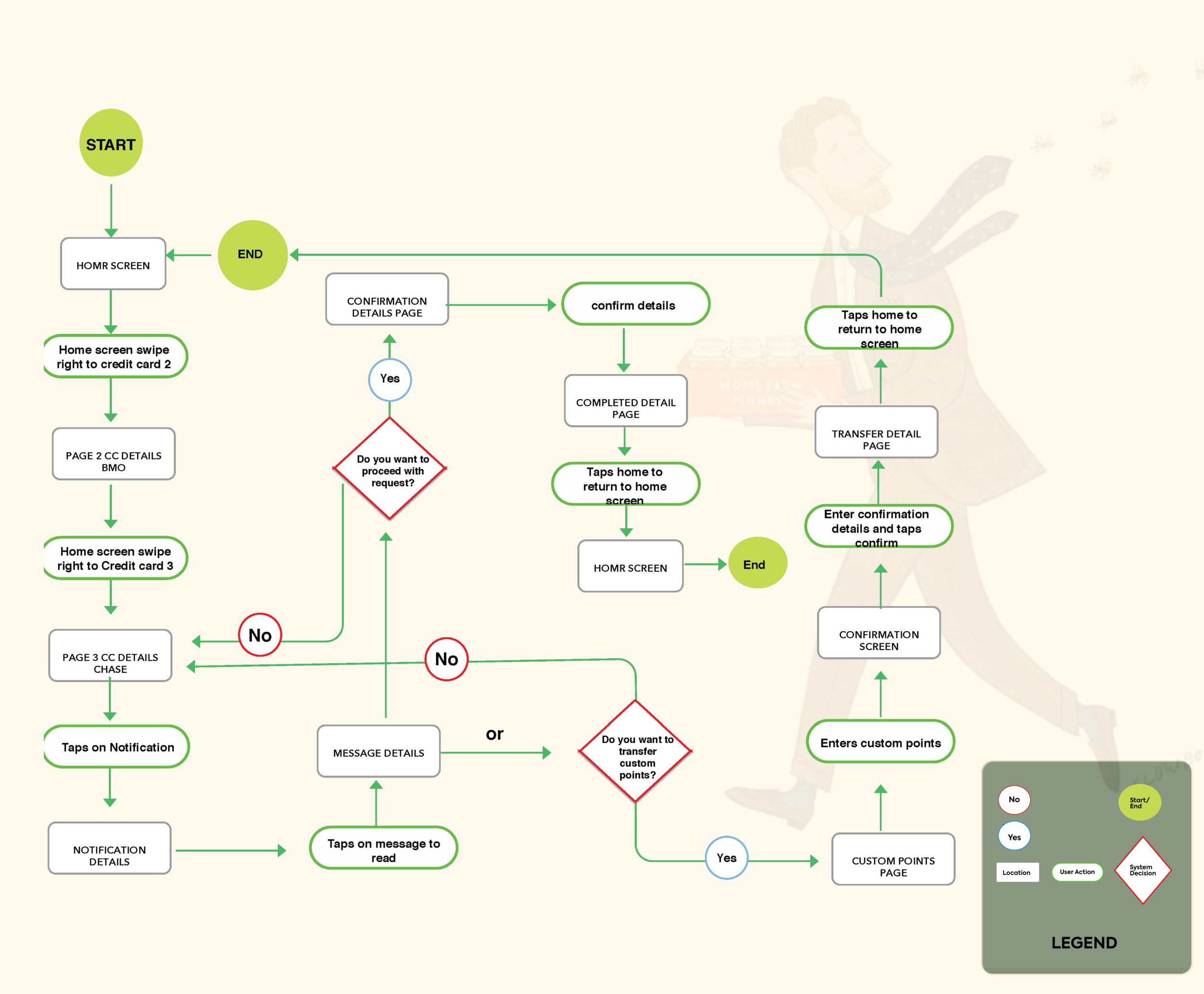
With my task flow done, I started to sketch ideas on paper of how my screens would look and how the primary task flow would be carried out. This proved so valuable, as I referenced these sketches again and again throughout my user testing.
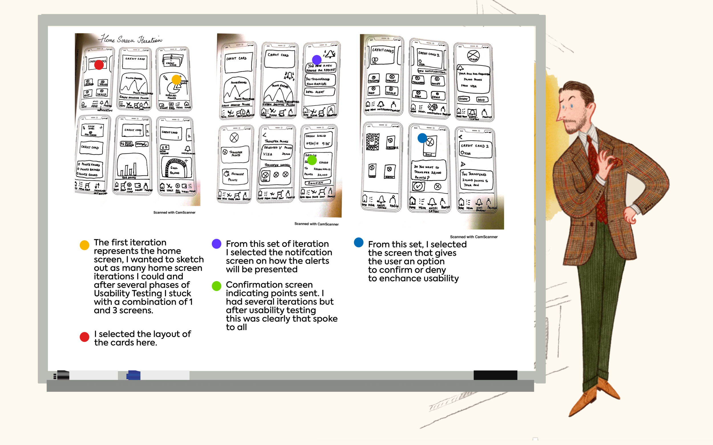
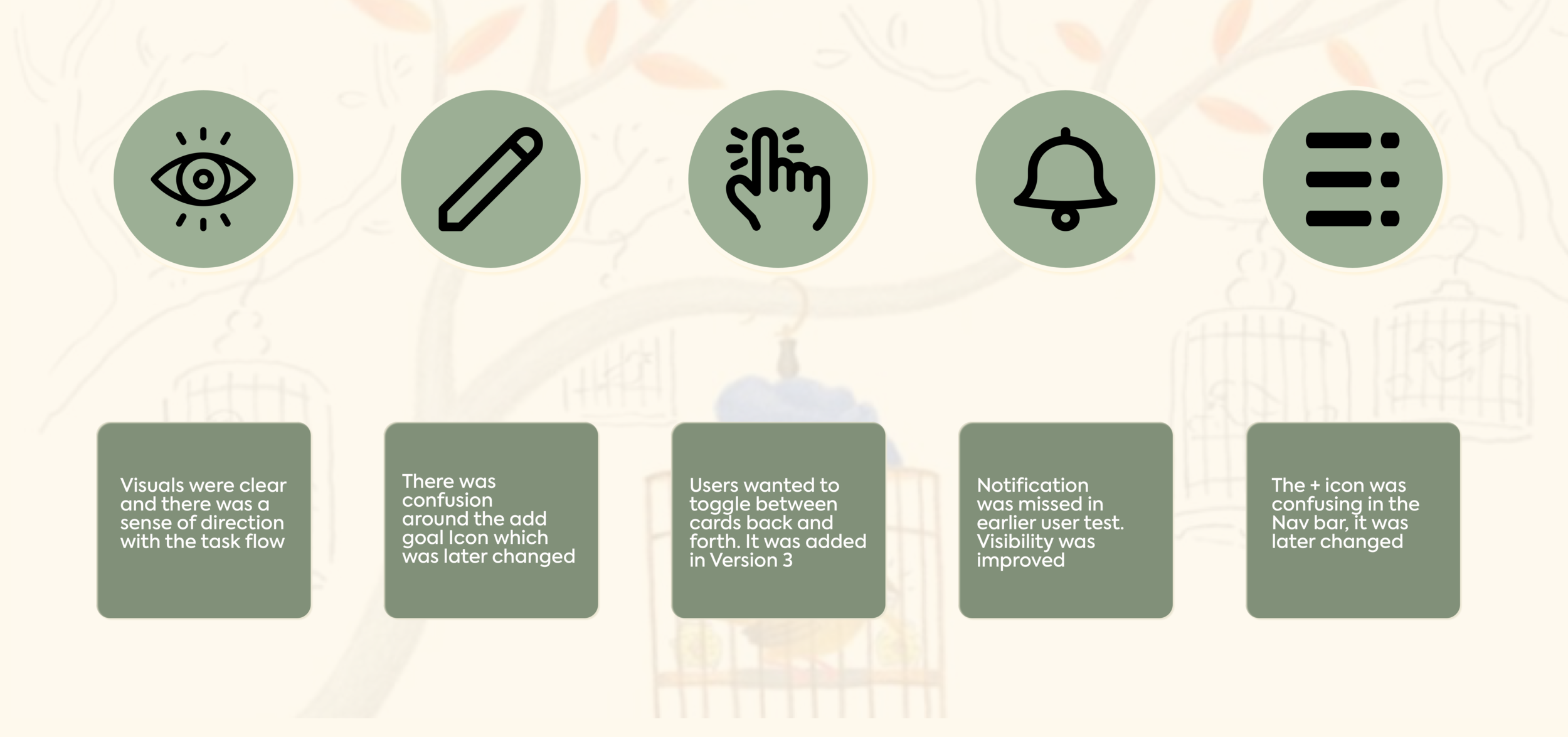
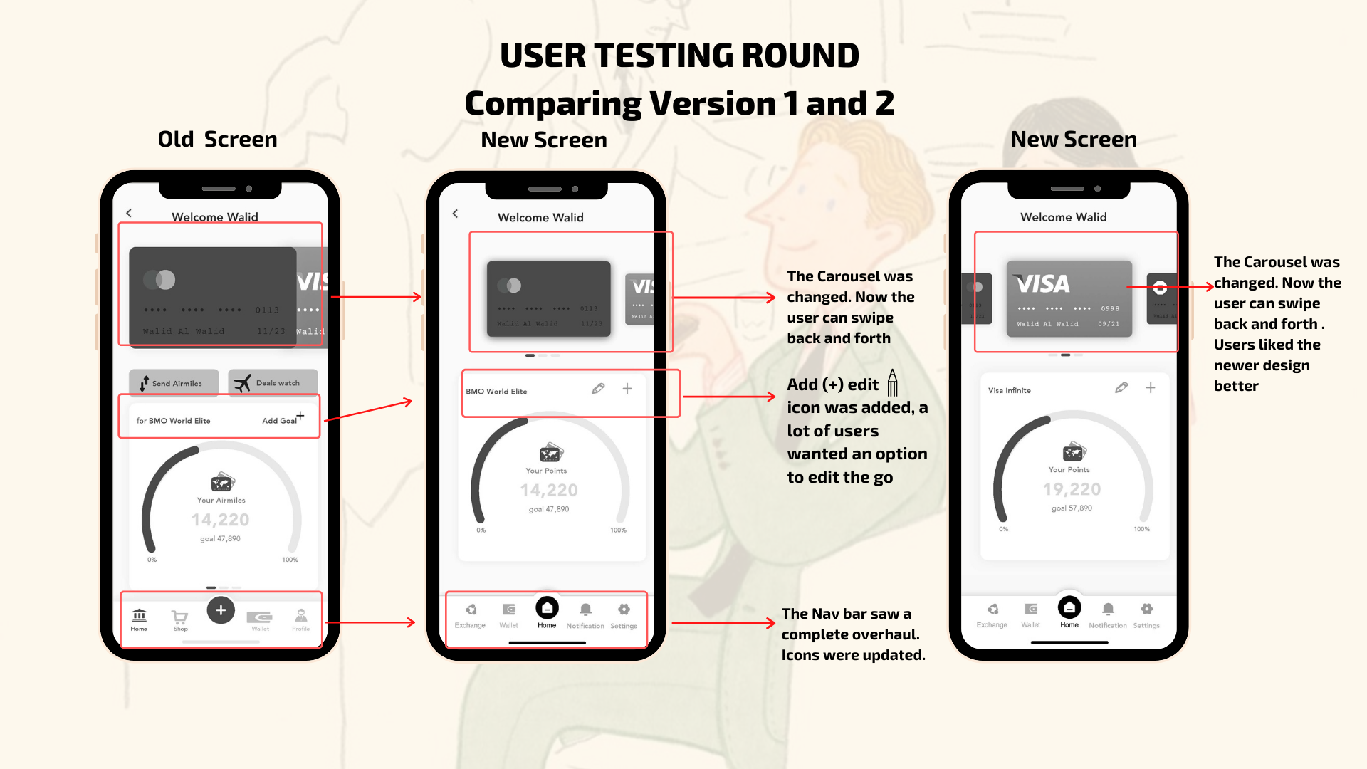
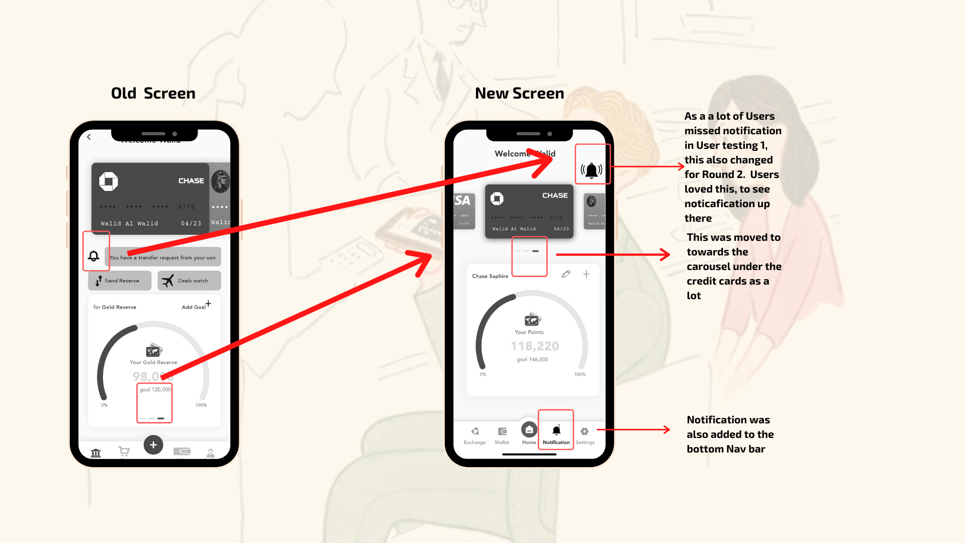
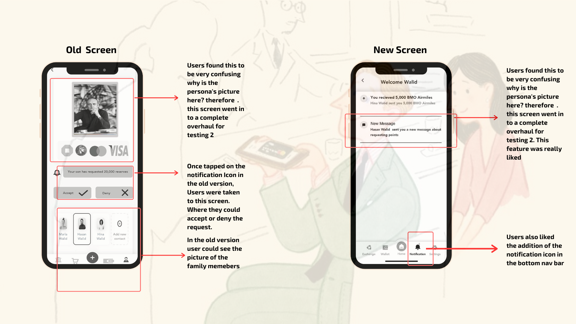
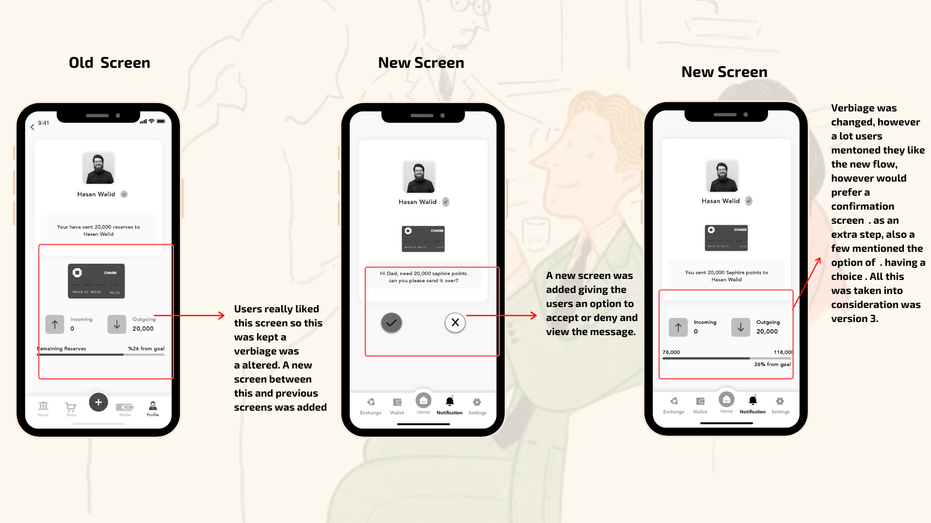
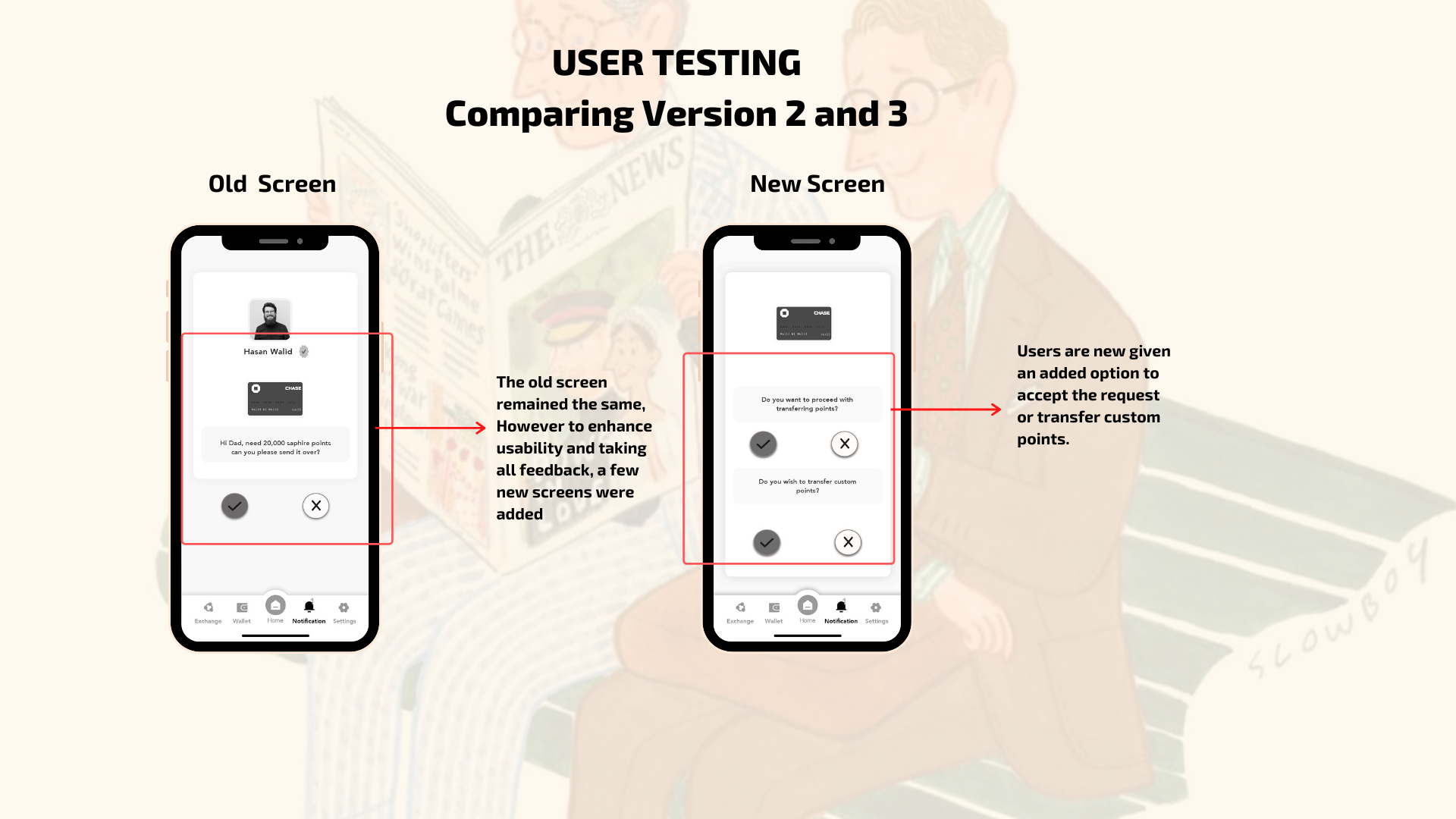
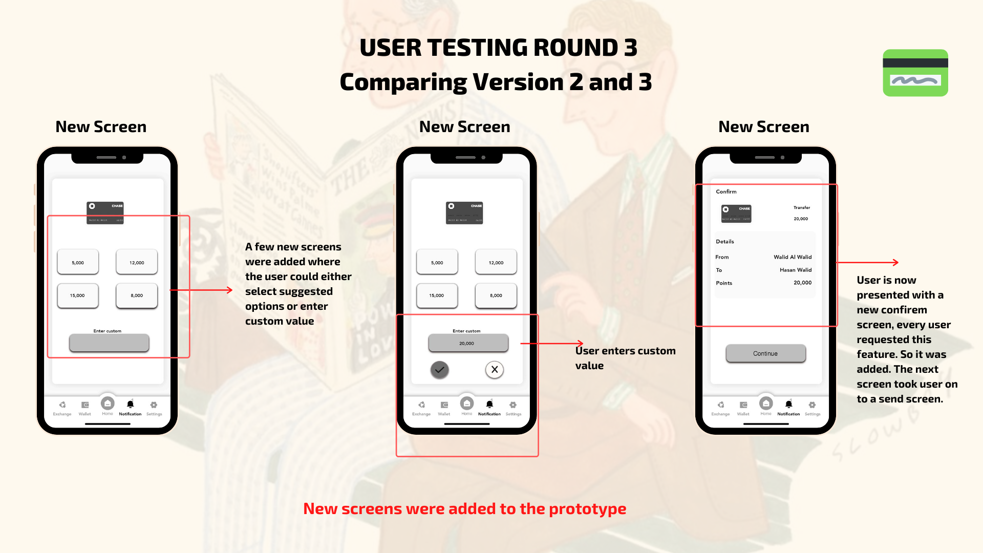
Usability Testing and Insights
I conducted 5 rounds of Usability testing with each round comprised of 5 user tests each round. Key insights from the feedback were taken into consideration while reworking the prototype. Here are a few key insights
Walid's biggest pain point was his inability to track his points and share them amongst his family instead of selling them at a very low rate on the open market.
Below is how the prototype evolved over the course of Usability testing as I went through 3 versions of the prototype.
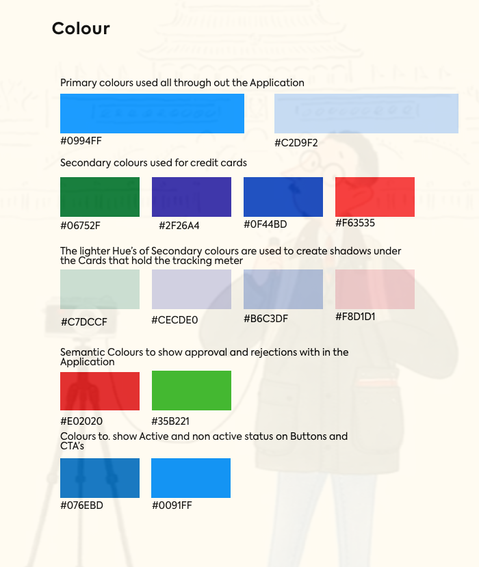
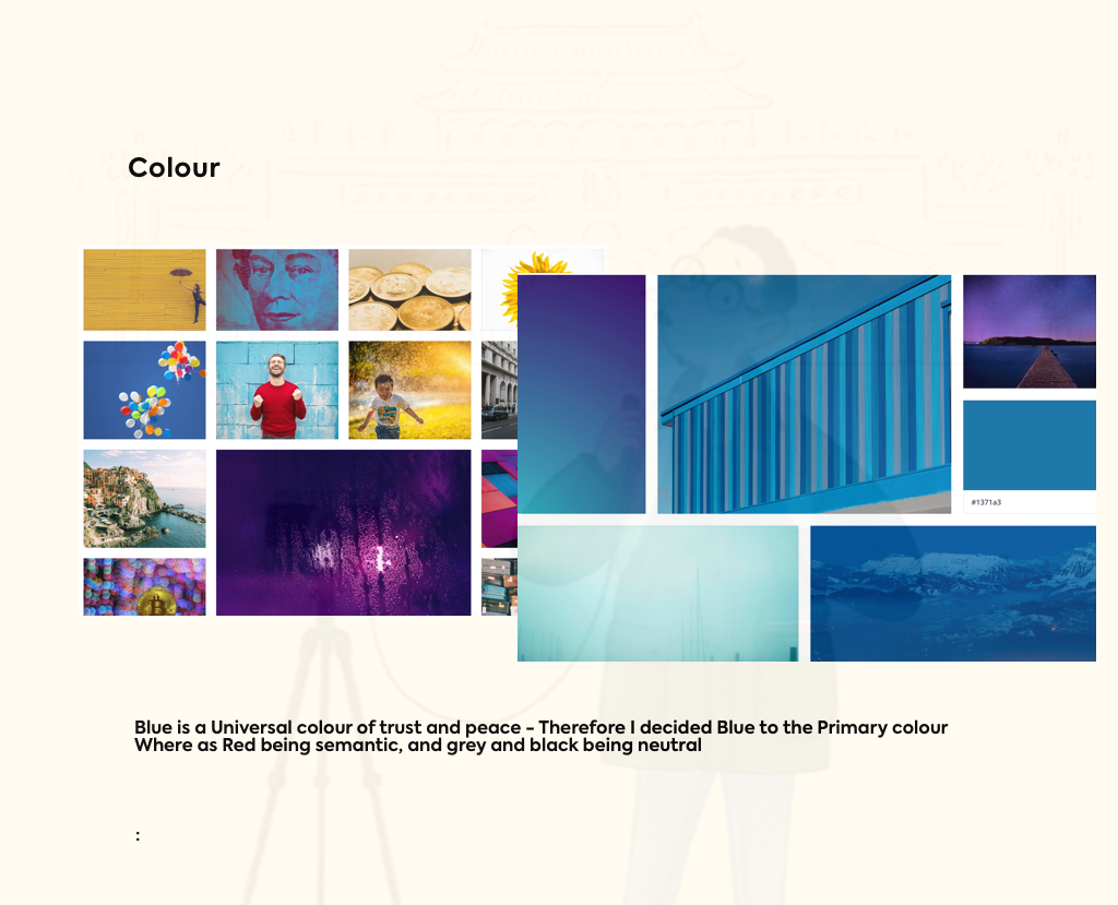
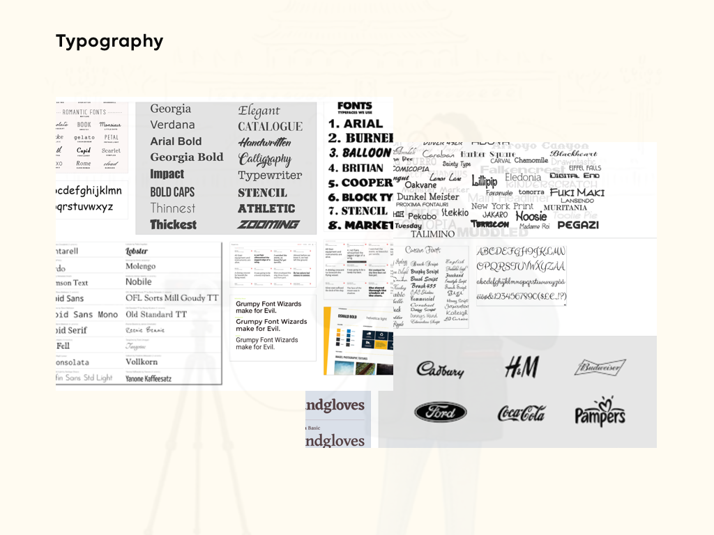
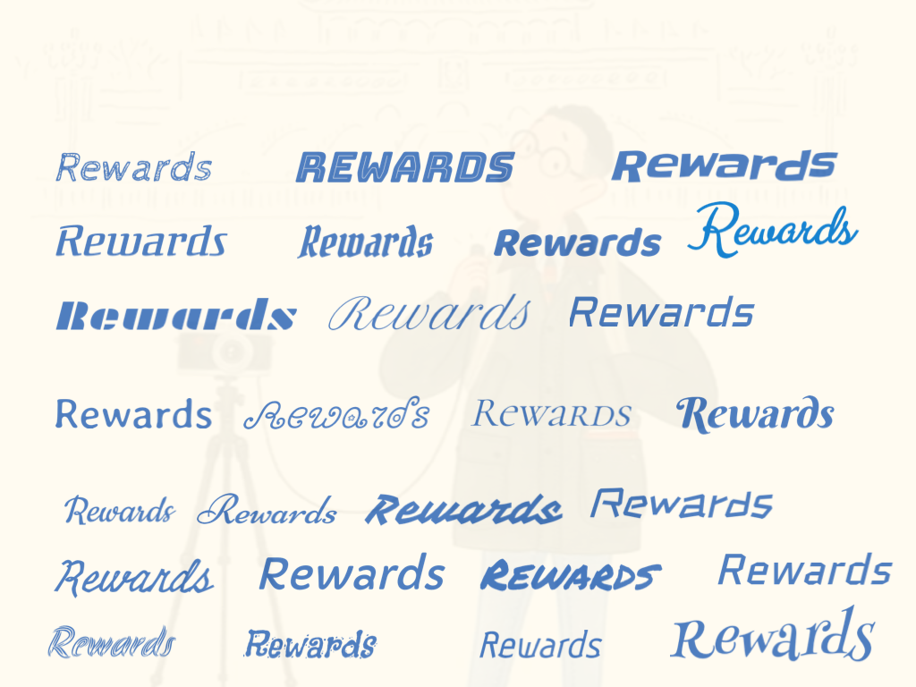
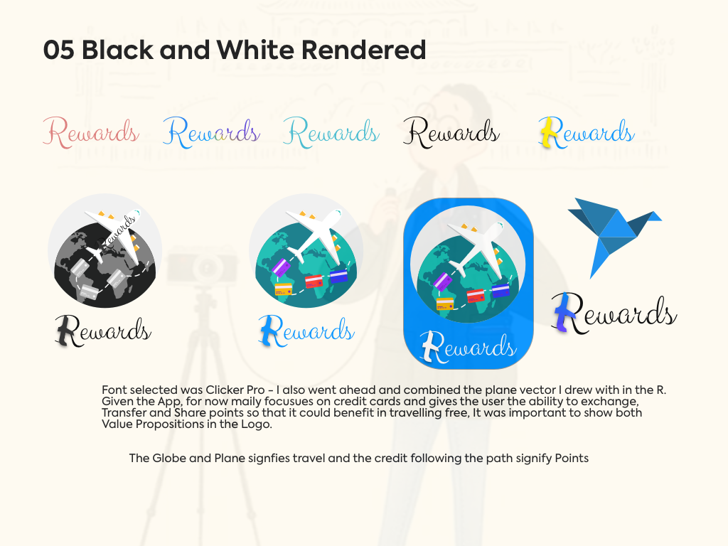
Visual Identity
I wanted to a capture an edgy, modern and conventional feel to my design. Financial products can be very traditional looking, so I wanted to play with colour to assure the user that this is not the same old play on rewards. Shades of blue spoke to me and signified what I was going for such which was delivering an app that was trustworthy.
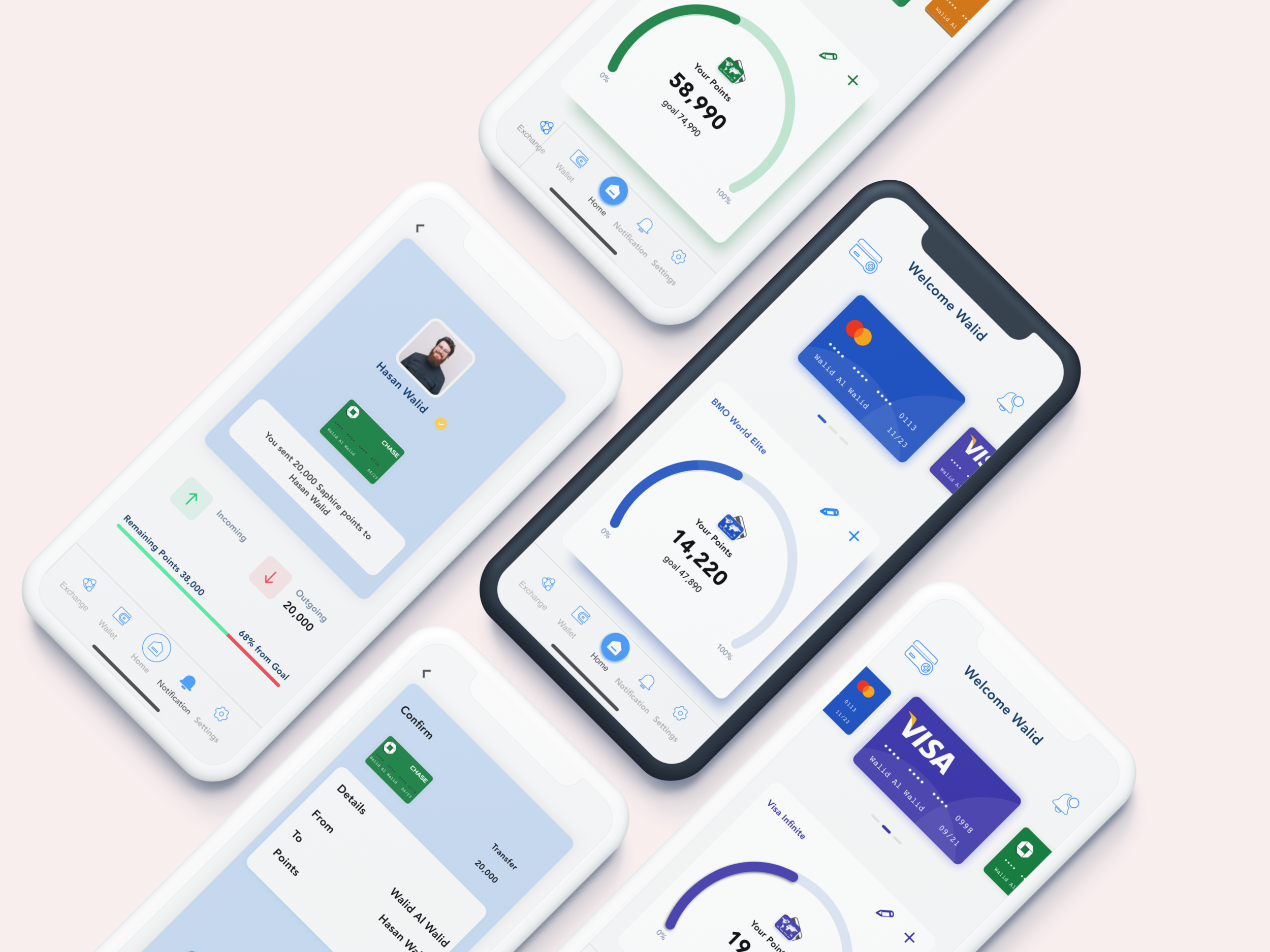
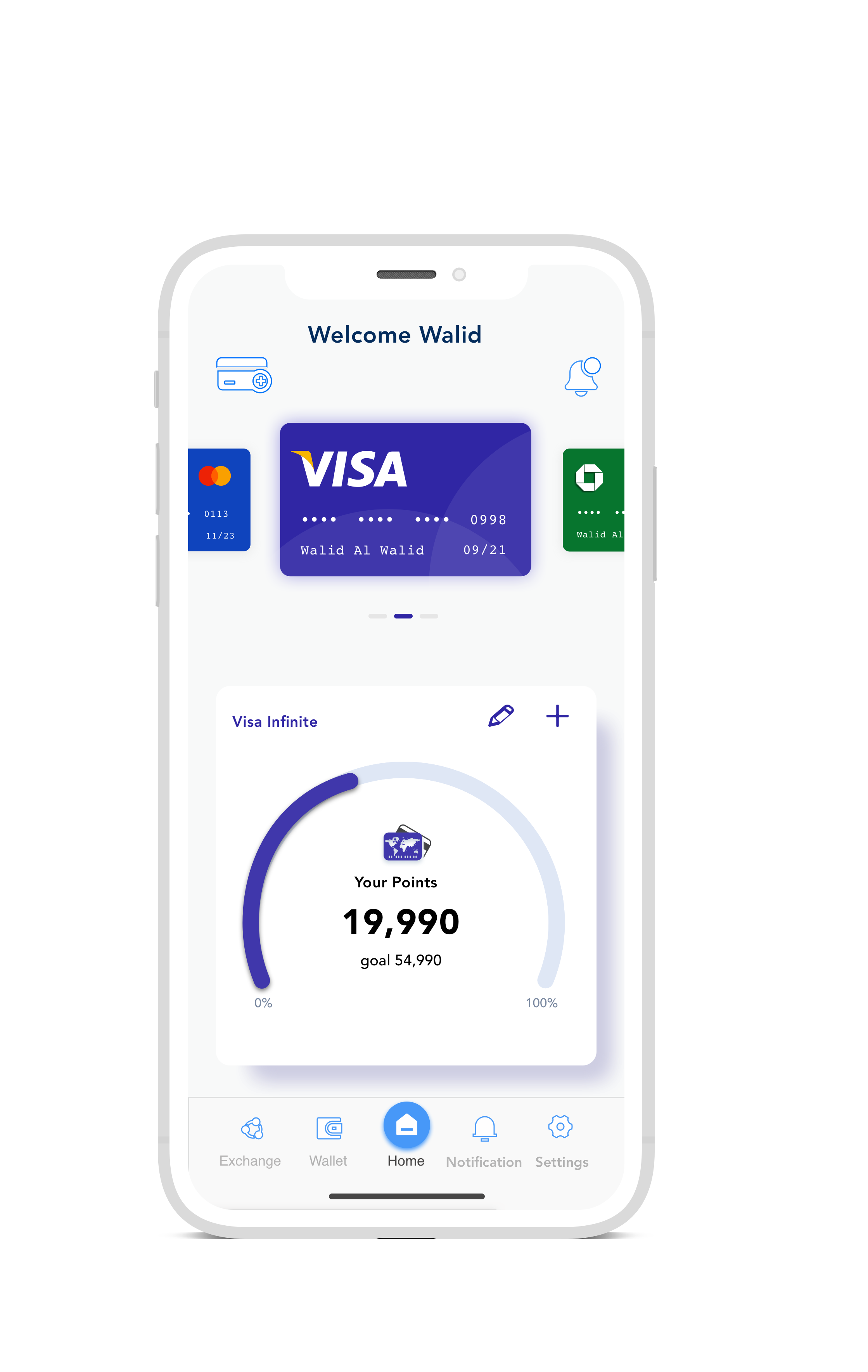
Final Prototype
The Rewards app was built to meet user needs and address current pain points with the inability to share or transfer reward points. With extensive user testing and iterating, I progressed from low-fidelity to high-fidelity prototyping. I wanted to leverage user-driven data to deliver professional product.
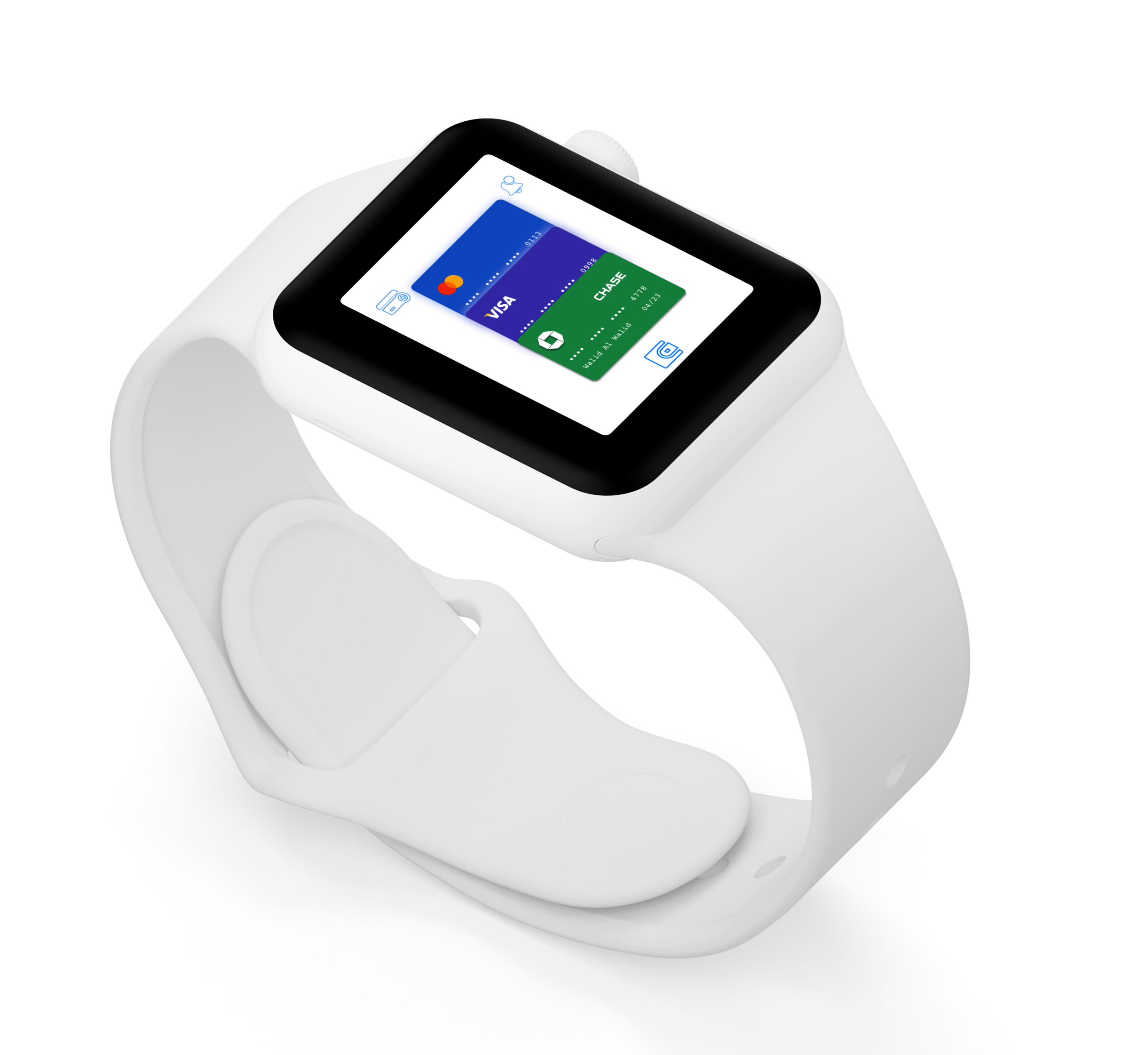
Apple Watch - Alternate Platform
After completing the final mobile app prototype, I developed a Apple watch version for rewards. It emphasizes and drives its unique value proposition that is its ability to track, manage, and edit rewards on the go. It carries over the visual identity of trustworthiness. Before finalizing the design, I created 5 mid-fidelity versions and conducted testing. After gathering feedback I created sketches for these screens, and finalized the screens in the prototype below within the constraints of Apple Watch’s lightweight screens. In total, the design process went through 5 variations with the biggest change occurring in Version 4. The process started with sketching a few ideas down, which I referred to throughout the process to build on ideas. When I started imaging my app translated onto different platforms, it was obvious that it would be a valuable app for the Apple Watch.
Reflection and Next Steps
The goal of this project was to meaningfully impact the experience of users and add value to their interactions through the Rewards App. What I learned was that the process is subjective, however all changes were driven solely by informed research and feedback.
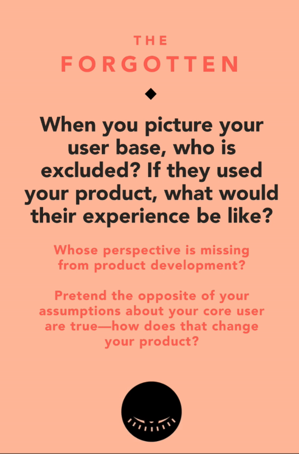
I did a fun activity to wrap up my case study, cycling Tarot Cards of Tech amongst my peers. I received “The Forgotten” , which prompted me to look at the Rewards app from a different viewpoint, giving me a very interesting perspective.
Perspective 1
The Rewards app is heavily marketed and catered towards users in the West. As to point from my research findings credit cards have been an integral part of the western society for decades now. Where as in the east in countries like India, Indonesia, Thailand, Vietnam to name a few. The value of the credit card is not present as these societies have mainly been cash based societies. Over the last decade these countries have made huge surges in Fintech, introducing mobile paying applications such as Paytm where a user can just send money over a text message. Rewards points are very much western ideologies that have been part of the developed world. Therefore, if this App was introduced in any of the countries mentioned above it would be most likely be a failure and only be catered towards the upper middle class and the rich.
Perspective 2
On the other side just the sheer population in Asia marks almost the 40% of the world. The App could do quite well as there is a huge rise in the middle class and the upper middle class in these countries. However, there would definitely need modifications - such as add features similar to Wechat. Where a person can pay through app, track their spending, accumulate points etc. The demand for new technology is immense in the East, in many ways they just skipped the Industrial age and just adopted and transformed their economies by adopting to newer means.
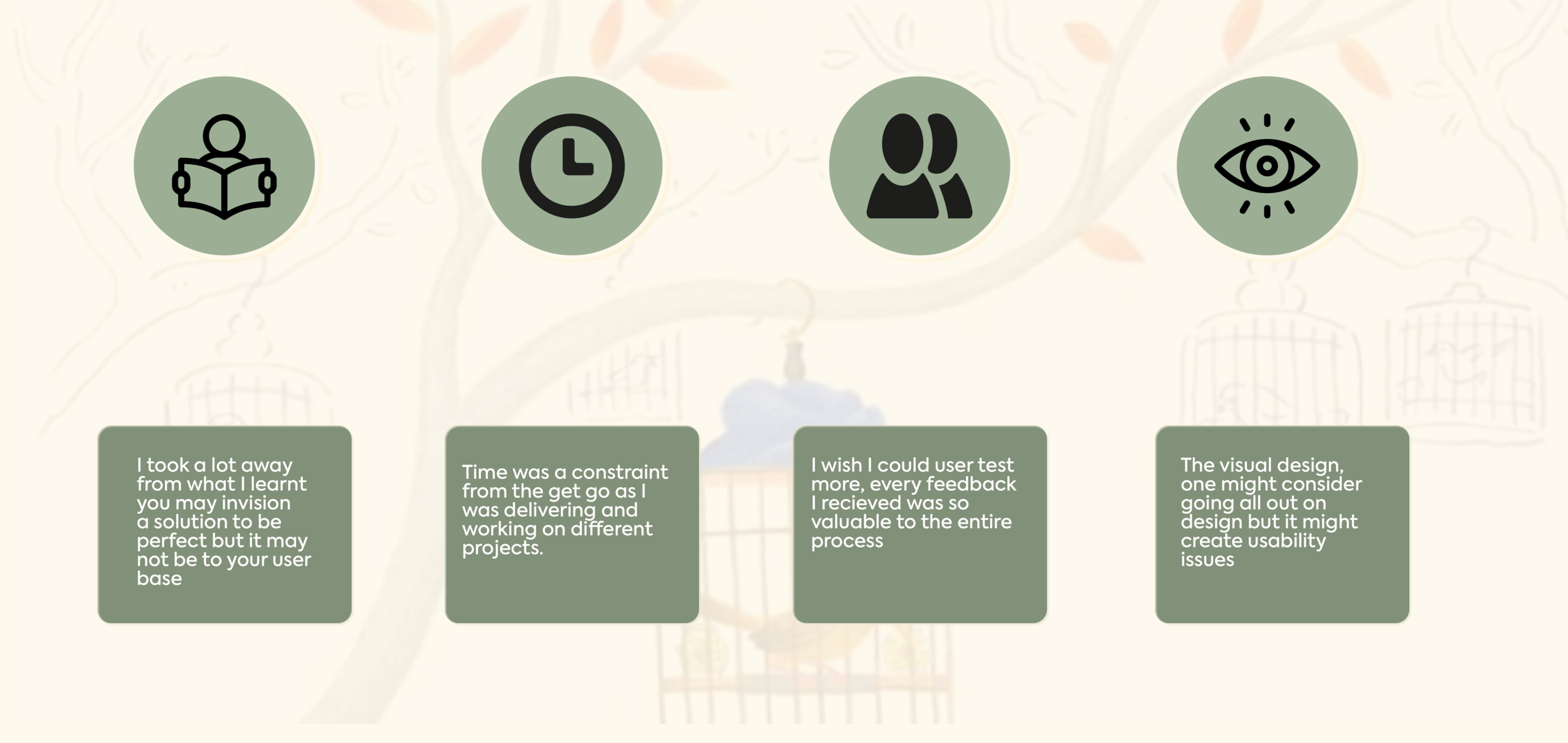
Below are my final thoughts and my key learnings from this project
Thank you!
Let’s Connect! If you enjoyed reading this case study and have more questions about my process drop me a line here